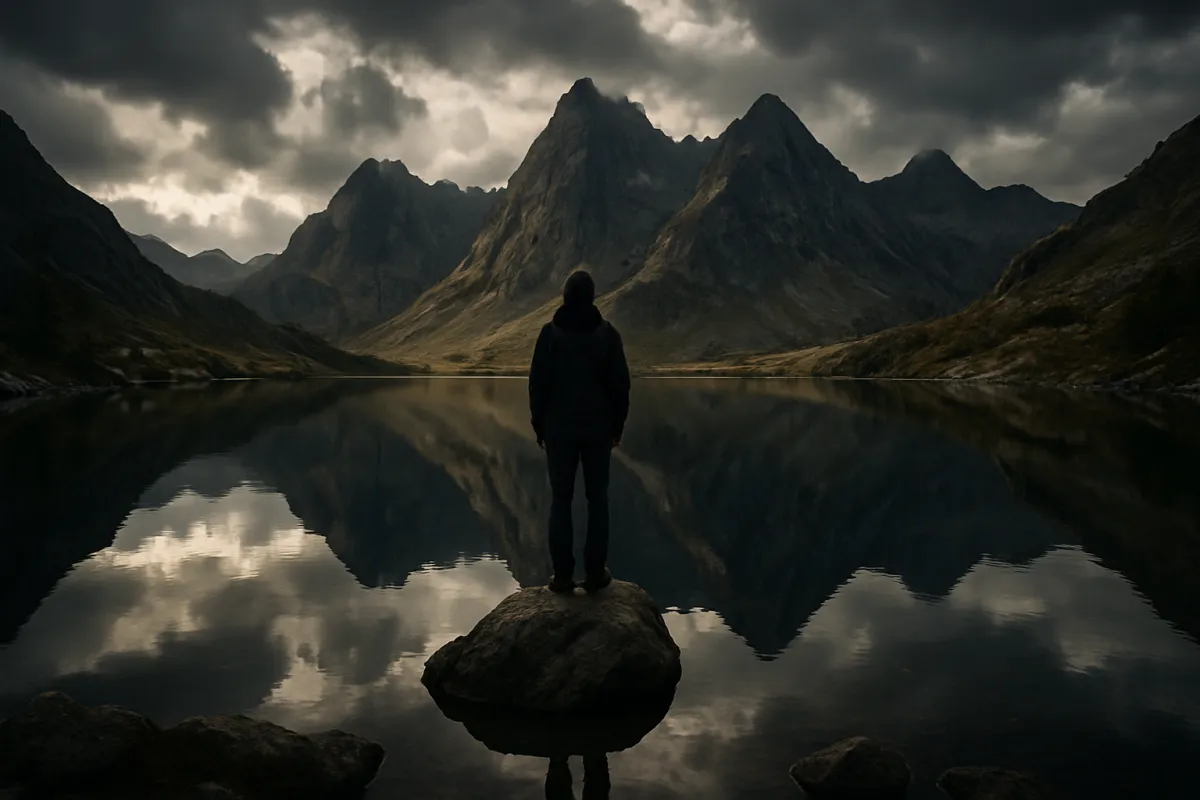
What's on this page
- What composition actually decides
- Rule 1: Thirds, and when to break them
- Rule 2: Leading lines that carry the eye
- Rule 3: Framing within the frame
- Rule 4: Symmetry, pattern, and the break
- Rule 5: Negative space as a subject
- Rule 6: Foreground, middle, and depth
- Rule 7: Subject placement and eye-line room
- Rule 8: Balance and visual weight
- How focal length changes a composition
- How aperture changes a composition
- Where to put the horizon
- The edges of the frame
- Backgrounds are half the photograph
- Simplify to one idea
- Horizontal or vertical: turning the camera
- Aspect ratio and the crop
- Light is a compositional tool
- Move your feet before you touch a dial
- A worked example: one scene, three framings
- Common composition mistakes
- Composition by subject: what changes
- How to practice composition on purpose
- Your composition checklist
- The bottom line
Short answer: Put the subject off center unless you have a reason to center it, use lines and foreground layers to lead the eye and build depth, leave meaningful space rather than filling every corner, and check the edges and background as carefully as the subject. Moving your feet changes a composition more than any dial. The rules are defaults for when you have no better idea; the skill is knowing when to abandon them.
Most photographers spend their first year fixing the wrong problem. They chase sharper glass, cleaner high ISO files and more accurate autofocus, and they end up with technically excellent pictures of nothing in particular. Composition is the part that decides whether a frame is worth taking at all, and it is the only part of photography that costs nothing, works identically on a phone and a professional body, and cannot be bought. Two people can stand in the same spot with the same camera and come away with completely different pictures, and the difference between them is entirely a set of decisions about where things sit inside a rectangle.
This field note covers eight framing rules that reliably produce a stronger picture, plus the reasons each one works and the situations where the opposite choice is better. It leans on the reference notes rather than repeating them: the settings behind these frames live in our exposure triangle field note, the focal length effects come from our focal length field note, and the background blur that separates a subject from its surroundings is explained in our aperture field note. If you are still deciding what to shoot with, price your options in the upgrade budget planner before you assume better gear will fix a weak frame.
Key takeaways
- Thirds is a default, not a law. It works because it leaves room and stops the centering reflex, and it fails on symmetry, pattern and direct portraits, where dead center is the point.
- Depth is built with layers. A near foreground, a middle ground and a far background turn a flat rectangle into a place, and stepping lower or closer creates the foreground for free.
- The background is half the photograph. Check what is behind your subject before you check your settings, because a pole growing out of a head cannot be fixed later.
- Focal length changes the frame and your feet change the perspective. A wide lens pushes you closer and stretches the near objects; a long lens pushes you back and stacks the layers.
- Give a moving or looking subject room in front of them, an illustrative two to one split of the frame width, so the picture reads as going somewhere rather than crashing into an edge.
What composition actually decides
Composition is the arrangement of everything inside the rectangle: what is included, what is excluded, where each element sits, how large it is, and what the eye touches first, second and third. That is a bigger job than the word suggests, because it is the only stage of photography where you decide what the picture is about. Exposure decides how bright the frame is, focus decides what is crisp, but composition decides what the viewer looks at and in what order.
The useful way to think about it is as attention management. A viewer’s eye lands somewhere first, usually on the brightest area, the sharpest area, a human face, or the point where strong lines converge. It then moves along whatever continuity it can find, and it leaves the picture at whatever edge lets it out. Everything in this field note is a technique for controlling that path: putting the subject where the eye already wants to go, building lines that carry attention toward it, and closing the exits so the eye stays inside the frame rather than sliding off a corner.
The reason rules exist at all is speed. In the moment, you have a few seconds to decide where to stand and what to include, and a default that usually works beats deliberating from first principles. Learn the eight below well enough that they become automatic, and you free up the attention you need for the thing rules cannot give you, which is noticing when the scene in front of you wants something else entirely.
Rule 1: Thirds, and when to break them
Divide the frame into nine equal rectangles with two vertical and two horizontal lines. The rule of thirds says put your subject on one of those lines, or on an intersection, rather than in the middle. Almost every camera and phone can display this grid, and turning it on is the single fastest way to start composing deliberately instead of by reflex.
It works for three concrete reasons. Off center placement leaves empty frame on one side, which becomes room for the subject to look into or move toward. It keeps the horizon off the middle line, so one half of the picture clearly dominates instead of two halves competing. And it interrupts the beginner reflex of putting everything dead center, which is what your eye does when you are not thinking, and which produces frames that feel static and identical to each other.
Now the important half. Thirds is a default for when you have no better idea, and there are three situations where centering is stronger. A symmetrical scene, such as a reflection or a corridor, wants the subject centered so the symmetry reads as intentional. A frontal portrait where the person looks straight down the lens gains confrontational power from dead center placement. And a subject surrounded by clean negative space on all sides can sit in the middle to feel isolated rather than merely uncentered. The tell is intent: a centered subject looks like a mistake when it is accidental and looks strong when everything else in the frame supports it.
Rule 2: Leading lines that carry the eye
A leading line is any linear element that pulls the eye along a path through the frame: a path, a road, a fence, a river, a shoreline, a stair rail, a row of windows, a long shadow, or the edge where a wall meets a floor. The eye follows continuity almost involuntarily, so a line is the most reliable way to send attention exactly where you want it.
Two details separate a line that works from a line that just exists. The first is destination. A line that leads to nothing dumps the eye off the far edge and out of the picture, so the line should arrive at your subject or point clearly toward it. If the road in front of you leads to an empty vanishing point, wait until a person or a vehicle occupies the end of it, or move so the road ends at something. The second is entry point. Lines usually read strongest when they enter from a bottom corner and travel into the frame, because that mirrors how a viewer scans, and weakest when they run flat across the middle, where they act as a barrier that cuts the picture into unrelated halves.
The way you shape a line is with your position, not your settings. Crouching lowers your viewpoint so a path stretches longer and steeper through the frame. Moving a step to the side changes the angle at which the same fence enters the picture. Convergence, where parallel lines appear to meet in the distance, is strongest with a wide lens used close, which is why our 35mm versus 50mm field note matters to anyone building frames around lines.

Rule 3: Framing within the frame
Framing within the frame means using something in the scene to surround your subject: a doorway, an arch, a window, overhanging branches, a gap between two buildings, the space under a bridge, or a foreground object that wraps around the edges. The technique costs nothing and does three jobs at once.
It isolates. A frame around the subject blocks out the parts of the scene that would otherwise compete, which is the cheapest way to clean up a messy background without moving anything. It adds depth. An interior frame is nearly always closer to the camera than the subject, so the picture immediately has a near layer and a far layer instead of one flat plane. And it directs attention, because a shape that encloses something tells the eye that the enclosed thing is the point, in the same way a picture frame on a wall does.
The practical decisions are about exposure and sharpness. An interior frame that is much darker than the subject reads as a silhouette border, which is usually what you want, so expose for the subject and let the frame go dark rather than trying to save detail in both. Decide deliberately whether the frame should be sharp or soft: a sharp frame at f/8 becomes part of the subject matter, while a frame thrown out of focus at f/2.8 becomes atmosphere. Both work, and the choice is covered by our depth of field field note. The one failure mode is a frame so heavy or so busy that it becomes the subject, at which point you have photographed a doorway with a person accidentally inside it.
Rule 4: Symmetry, pattern, and the break
Symmetry and repetition are the two cases where the usual advice inverts, and knowing that saves you from applying thirds to a scene that is begging to be centered. A symmetrical scene, whether a reflection in still water, a corridor, a facade or a face straight on, is strongest when the axis of symmetry runs exactly down the middle of the frame and the camera is square to it. Half-hearted symmetry, off by a few degrees or a few percent, is the worst outcome, because a viewer reads it as a failed attempt rather than a choice.
Getting it right is mostly craft. Use the camera’s electronic level, put the axis on the center gridline, and shoot from a height that keeps horizontal lines horizontal, because tilting the camera up or down makes vertical lines converge and destroys the effect. Reflections in water want a low viewpoint and still air, and the horizon in that case sits exactly on the middle line, which is the one time the middle horizon is correct.
Pattern is symmetry’s repeating cousin: rows of windows, stacked crates, tiles, market produce, a crowd of umbrellas. A pure pattern filling the frame edge to edge makes a graphic, abstract image, and it works best when you let the pattern run off all four edges so it feels endless rather than like an object you photographed. The stronger picture, more often, is the break in the pattern: one red door in a row of blue ones, one person facing the wrong way. Place the break off center on a third, and you get both rules at once, the rhythm and the interruption.
Rule 5: Negative space as a subject
Negative space is the empty area you keep on purpose: plain sky, still water, a blank wall, deep shadow, fog, or a background so out of focus it becomes a field of color. Beginners crop it away because it feels wasteful. It is not waste; it is the quiet that makes the subject audible, and it is one of the few compositional tools that communicates a feeling directly rather than by arrangement alone.
Use it when the emptiness means something. A small figure against a vast empty area says scale and solitude. A single object on a clean surface says calm and precision, which is why it dominates product and food work, as our product photography field note covers. A face pushed to one side of an otherwise empty frame says restraint. In every case the emptiness is carrying a message, which is the difference between negative space and dead space.
Two rules keep it honest. The empty area must actually be clean, because a busy background is clutter no matter how much of it you include, and a wide aperture or a change of angle is how you clean it. And the emptiness has to earn its place, which you test by imagining a tighter crop: if the picture improves when you cut the space away, it was not negative space. There is a practical bonus worth knowing if you ever shoot for a client or a cover, which is that a large clean area is where text goes, and images with room for a headline get used more often than images without.
Rule 6: Foreground, middle, and depth
A photograph is a flat rectangle pretending to be a three dimensional place, and the technique that sells the illusion is layering: something near, something in the middle, something far. Most weak scenic frames fail because they contain only a middle and a far layer, so the picture reads as a postcard of a view rather than a place you could walk into.
The fix is almost always physical and takes about five seconds. Crouch, and the grass, rocks, flowers or wet sand at your feet enter the bottom of the frame as a near layer. Step forward until a boulder, a branch or a railing sits close to the lens. Shoot through something rather than around it. What you are doing is creating a size difference between near and far objects, and that size difference is what a viewer’s brain reads as distance. Because near objects grow dramatically as you approach them, a wide lens used close exaggerates the effect, which is the real reason wide lenses feel spacious.
Two things to control. Depth of field has to cover both layers if both should be sharp, so stop down toward f/8 or f/11 and focus into the scene rather than on the very nearest rock, and our sharp photos field note covers the trade with diffraction. And the foreground has to be interesting in its own right, because a boring near layer just adds clutter to the bottom third. A foreground that is genuinely soft and abstract can work too, acting as a colored veil at the frame edge rather than a described object.

Rule 7: Subject placement and eye-line room
When your subject is a person, an animal or a vehicle, it has a direction, and direction changes where it should sit in the frame. The rule is to leave more space on the side the subject faces or moves toward than on the side behind it. Photographers call it looking room or lead room, and its absence is one of the most jarring errors in a frame, because a person looking straight into a nearby edge makes a viewer feel the picture is cut off.
A workable default is to place the subject on the vertical third nearer the side they came from, which puts them roughly a third of the way across the frame and leaves about two thirds of the width ahead of them, a ratio of about two to one. That split is illustrative rather than fixed, and the right number varies with how fast the subject is moving and how much of the frame they occupy, but starting from two to one and adjusting by eye is far better than centering.
Two refinements matter. The eye-line matters more than the body, so a person whose body faces you but whose head is turned needs the room on the side the eyes point, not the shoulders. And for a tight head and shoulders portrait, the eyes should sit roughly on the upper horizontal third rather than in the middle of the frame, because centering the eyes leaves an odd amount of headroom above and crops the chest awkwardly below. Our portrait field note works through the rest of that framing.

Rule 8: Balance and visual weight
Every element in a frame has visual weight, meaning the amount of attention it pulls. Weight comes from size, from brightness, from contrast against the surroundings, from color saturation, from sharpness, and from being a face or a written word, since human eyes lock onto both. Balance is the sense that the total weight is distributed in a way that does not make the picture feel like it is tipping over.
The reason this matters is that an off center subject creates an imbalance by definition, and something has to answer it on the other side. That counterweight does not need to be equal in size, which is the point most explanations miss. A large subject on the left can be balanced by a very small bright element on the right, because brightness carries weight out of proportion to area. A dark, heavy foreground at the bottom can be balanced by a bright sky at the top. A person on one third can be balanced by the empty space they look into, which is why looking room feels right rather than merely conventional.
There are two ways to use this in practice. Symmetrical balance places matched weights on either side and feels formal, calm and static, which suits architecture and still life. Asymmetrical balance uses unequal elements that still settle, and it feels dynamic and more natural, which suits most other work. The failure mode to watch for is a heavy element stranded in one corner with nothing anywhere else, which reads as an accident. Squint at the frame until detail disappears and only blobs of tone remain, and you can see the weights immediately.
How focal length changes a composition
Here is the honest mechanism, because it is widely garbled. From one fixed position, changing focal length does nothing but crop. A 100mm lens shows a smaller slice of exactly the same scene a 50mm lens shows, with the relative sizes of near and far objects unchanged. Perspective, meaning how big the near thing looks compared to the far thing, is set entirely by where the camera is, not by the glass on the front.
What makes focal length feel compositional is that nobody stands still. Pick a wide lens and, to fill the frame with your subject, you walk closer. That short working distance makes near objects large and distant objects small, stretching the scene, exaggerating any foreground and making a room or a street feel spacious. Pick a long lens and you step back to fit the subject in, and that long working distance flattens the size difference between layers, so hills stack up behind each other and a distant building looms over a nearby person. This stacking is what photographers call compression, and it is one of the most useful compositional effects available. Our telephoto field note covers the reach side of it.
So the practical decisions are these. Choose a wide field of view when you want depth, foreground and a sense of place, and accept that you must get genuinely close to your subject for it to work. Choose a long focal length when you want to simplify, because a narrow angle of view excludes clutter automatically, and when you want the background to feel large and close behind your subject. The prime versus zoom field note covers whether to carry one option or several, and the upgrade budget planner will tell you what the choice costs.

How aperture changes a composition
Aperture cannot move a single object in the frame, yet it changes what a viewer sees first, which makes it a compositional control in everything but name. Opening up to f/1.8 or f/2.8 shrinks the zone of sharpness to a thin slice, so the background dissolves into soft tone and color. That does two compositional things at once: it separates the subject from its surroundings without you moving, and it converts a cluttered background into simple shapes, which is often the only way to shoot in a place you cannot control.
Stopping down to f/8 or f/11 does the opposite and keeps the background legible. You want that whenever the background is part of the story: a person in a room that says something about them, a subject against a pattern you want readable, a scene where near and far layers should both be sharp. Choosing a wide aperture in those situations throws away the very information the picture needed.
Two details keep this from going wrong. Background blur depends on more than the f-number, because a longer focal length and a greater distance between subject and background both increase it, so stepping your subject further from the wall does more than opening one extra stop. And a very wide aperture leaves so little depth of field that a slightly missed focus ruins the frame, which is a real risk when you are also thinking about placement. The mechanism behind all of this is in our aperture field note, and the practical settings order is in our manual mode field note.
Where beginner framing usually goes wrong
Illustrative weighting, out of 100, of how often each framing fault is the reason a photo feels weak in everyday shooting. This is a mental model built from common experience rather than a measured study, so read it as an order to check things in.
The background and the centering reflex account for most weak frames, which is why the first thing to check is what is behind your subject and the second is whether you centered it by choice. Tune the order to your own shooting with the companion above.
Where to put the horizon
The horizon is the strongest line in most outdoor frames, and where you place it is a decision about what the photo is about. The one placement to avoid is exactly halfway, because two equal halves compete and neither wins, so the picture reads as undecided. Everywhere else is available.
Put the horizon low, near the bottom third, when the sky is the interesting half: heavy cloud, color at the ends of the day, a storm building. Put it high, near the top third, when the ground, the water or the foreground is more interesting, which is usually the case when you have found a strong near layer. Push it right up to the top edge or right down to the bottom edge when one half of the scene is genuinely empty, which turns the empty half into negative space and makes the choice look deliberate rather than lazy. The single exception to all of this is a symmetrical reflection, where dead center is correct and anything else breaks the mirror.
The other half of horizon work is keeping it level. A tilted sea or a leaning building reads as a mistake in a way that almost nothing else does, because viewers know which way gravity points. Turn on the camera’s electronic level and use it, because fixing a tilt later means rotating and cropping, which costs resolution and can push an element you wanted out of the frame. Our editing field note covers the repair when you do need it.
The edges of the frame
Beginners look at the middle of the viewfinder. Experienced photographers look at the edges, because that is where compositions break, and it is the single highest value habit in this field note. Before you press the shutter, run your eye around all four borders and ask what is touching them.
Three specific faults live at the edges. First, half objects: an arm, a car bumper, half a face, a chair leg entering from the side. A partial object at the edge nags at a viewer, because the mind tries to complete it and cannot, and it is fixed by either including the whole thing or excluding it entirely. Second, bright areas at the edge, such as a patch of blown sky through a gap in trees or a lit doorway. Brightness pulls the eye, and a bright edge acts as an exit door that leads attention out of the picture. Third, mergers, where a background line appears to touch or grow out of your subject, the classic being a pole or branch rising out of someone’s head. Half a step to either side usually cures it.
There is a fourth consideration, which is headroom and how tight you dare to crop. Too much space above a person’s head makes them look small and stranded, while cropping into the top of the head is a deliberate, intimate choice that looks confident when it is clearly intentional and looks like an accident when it clips by a few millimeters. Choose one or the other and commit.
Backgrounds are half the photograph
If you fix only one thing after reading this, make it the background. A viewer sees the whole rectangle at once, so a distracting background is not a minor flaw at the back of the picture, it is fifty percent of what they are looking at. The habit worth building is checking behind the subject before you check anything on the camera.
You have four tools, in order of how much they cost you. Move yourself, which is free and usually best: one step to either side swaps the entire background, and lowering the camera can replace a car park with sky. Move the subject, which works whenever you can ask, and often means turning a person ninety degrees so a clean wall replaces the street behind them. Open the aperture, which softens what you cannot remove, and is more effective the further your subject stands from whatever is behind them. Or wait, since a background containing people, traffic or shifting light will clean itself up if you give it a minute.
Watch for the specific offenders rather than a general sense of mess: bright patches that outrank your subject in tone, strong lines running into a head or shoulder, saturated color that pulls the eye, text and signage, which viewers read involuntarily, and faces in the background, which compete with your subject’s face on unfair terms. Interior work has its own version of this problem, and our real estate field note covers how to control a room you cannot rebuild.
Simplify to one idea
The most common failure in a photograph made by an enthusiastic beginner is not a wrong rule, it is too much. Standing in front of something impressive, the instinct is to include all of it, and the result is a frame with six candidate subjects and no main one, so the eye wanders and settles nowhere. A strong photograph is usually about one thing.
The discipline is to name your subject in a short phrase before you frame. Not the scene, the subject: the red door, the woman laughing, the way the light falls across the stairs. Once you can name it, every other element in the frame has to justify its presence by supporting that idea, and anything that does not support it is either excluded, pushed to the edge, or thrown out of focus. This is why exclusion is the more advanced half of composition; deciding what to leave out is harder than deciding what to include.
Three moves simplify a frame. Get closer, which is the oldest advice in photography and still the best, because it removes everything around the subject automatically. Use a longer focal length, which excludes clutter by narrowing the angle of view when you cannot physically approach. Or find a plain backdrop such as sky, water, a wall or deep shade, and place the subject against it. Detail work lives at the extreme of this idea, where a subject fills the frame entirely, and our macro field note covers what changes when you get that close.
Horizontal or vertical: turning the camera
The camera arrives in your hands horizontal, and most people leave it that way for years without deciding to. Orientation is a composition choice, and turning the camera ninety degrees is often the largest single improvement available to a frame.
A horizontal frame suits scenes with width: wide views, a group of people side by side, motion running left to right, any subject where the relationships between things across the picture matter. It reads as calm and expansive because it matches the way human vision is arranged. A vertical frame suits height and isolation: a standing person, a tall building, a waterfall, a tree, a path receding away from you. It crops out clutter on either side automatically, which makes it the quiet fix for a busy environment, and it emphasizes the up and down movement of a subject.
Two practical notes. Where the picture will end up matters, since phone screens are vertical and most prints, monitors and projected slides are horizontal, so a frame that will live on a phone deserves a vertical version. And square is a real option, not a compromise: it removes the tension between the two axes entirely, and it suits centered subjects, symmetry and pattern, which is why so much detail and still life work sits comfortably in a square. Shoot a scene both ways whenever you have time; it costs nothing and you will often be surprised which one wins.
Aspect ratio and the crop
Every frame has an aspect ratio, and it is a compositional element even when you never change it. A 3:2 rectangle, the shape most interchangeable lens cameras produce, is relatively long and lends itself to horizontal arrangements and to thirds. A 4:3 frame, common on phones and smaller sensor formats, is squarer and holds a centered subject more comfortably. A 16:9 crop is cinematic and strongly horizontal, which suits wide views and looks wrong around a standing person.
Cropping later is a legitimate compositional tool and not an admission of failure, but it has a cost and a discipline. The cost is resolution, since every crop throws away pixels, which matters if you print large, as our printing field note explains. The discipline is that cropping cannot add anything: it cannot give you a foreground you did not shoot, it cannot move a pole away from a head, and it cannot create looking room on a side you cut too tight. So compose in camera as though there will be no crop, then treat cropping as a refinement rather than a rescue.
One habit is worth adopting deliberately, which is leaving a small margin around the subject when you shoot for a specific output whose ratio you do not control. Shooting a fraction wider than feels right gives you room to crop to whatever shape the final use demands without amputating anything, and it costs you very little.
Light is a compositional tool
Light is usually filed under exposure, but it belongs here, because the eye goes to the brightest part of a frame before it goes anywhere else. That means light is placement: whatever you illuminate becomes the subject, whatever falls into shadow recedes, and you can compose with tone alone even when the physical arrangement is fixed.
Three effects are worth using on purpose. A pool of light on a subject with darker surroundings works exactly like a frame within the frame, isolating without any physical object, and it is why a shaft of window light across a table produces such strong pictures. Directional side light rakes across texture and creates shadows that behave as lines, which you can then treat as leading lines. And backlight turns a subject into a silhouette, which strips it to pure shape and simplifies a frame more brutally than any crop, at the price of losing all detail in the subject.
Shadows deserve to be treated as objects rather than as absence. A long shadow at the end of the day is a shape you can place on a third, a line you can lead with, or a mass you can use as counterweight. Time of day changes all of it, since low sun produces long shadows and directional light while midday sun produces short, flat, high contrast light that flattens shape. Our golden hour field note covers when to be out there, and if you are working with added light, our external flash field note covers where to put it.
Move your feet before you touch a dial
Almost every problem described so far is solved by standing somewhere else. Position controls perspective, background, the angle of every line, whether a foreground exists, and how large the subject looks relative to the scene. No setting on the camera controls any of those, which makes movement the most powerful compositional tool you own, and it is the one beginners use least.
Height is where the biggest gains hide. Nearly everyone shoots from standing eye level, which is why nearly all amateur photographs look alike. Crouching creates a foreground, makes a subject look taller and more imposing, and puts more sky behind it. Getting down to ground level does the same much harder. Climbing above the scene, even by standing on a step, turns a crowd into a pattern and a street into a graphic layout. Photographing a child or an animal from their eye level rather than looking down at them changes the picture from an observation into an encounter, which is the main lesson of our pet photography field note.
The habit to build is working a scene rather than taking a picture of it. When you find something worth photographing, take the obvious frame first so you have it, then deliberately take five more: lower, higher, closer, from the side, and from behind something. Later, at full size, one of the five is usually clearly better than the one you would have gone home with. That is composition being learned in real time, and it is free.
A worked example: one scene, three framings
Here is a single realistic scene run through the decisions, with illustrative numbers so the sequence is concrete. You are photographing a friend walking along a gravel path beside a lake in late afternoon. She is moving from left to right and looking ahead. Behind her, across the water, is a busy far shore of parked cars and buildings. You have a 50mm lens on a full frame body.
The frame you take first. Standing at eye level, you center her, include the whole scene, and shoot at f/8. It is a record of the moment and it is flat: the path runs across the middle as a barrier, the far shore competes for attention, and she sits dead center with equal space on both sides, so she looks stalled rather than walking.
The framing decisions. You move so the path enters the bottom left corner and runs toward her, which converts it from a barrier into a leading line. You place her on the left vertical third, about 33 percent across the frame, leaving roughly 67 percent of the width ahead of her and 33 percent behind, a ratio of about 2 to 1 in favor of the direction she is going. You crouch, which brings the gravel and grass into the bottom of the frame as a near layer and lifts the horizon to roughly the upper third, since the water and path are more interesting than a plain sky. You open to f/2.8 because the far shore is cluttered and cannot be moved, and at that aperture the cars and buildings reduce to soft blocks of tone while she stays sharp.
The third framing. You take one more with a different idea: you step back, put her small against the open water with the busy shore excluded entirely, and let two thirds of the frame be empty water. Same subject, same light, and now the picture is about scale and quiet rather than about her walking. The working numbers for the second frame were 50mm, f/2.8, subject at 33 percent across, 2 to 1 looking room, horizon on the upper third. Nothing there required equipment you do not have, and if you are still tempted to blame the lens, price the alternative in the upgrade budget planner before you buy.
What decides whether a frame works
Illustrative share of the work each group of decisions contributes to a strong composition. The three parts sum to the whole result, so no single choice does it alone.
Most of a composition is decided before the camera is raised, by where you stand and what you refuse to include. Lens and aperture choices refine a frame that position and placement already made. Adjust the split to your own work with the companion above.
Common composition mistakes
Most weak frames fail in a handful of predictable ways, and recognizing them in your own pictures is faster than memorizing more rules:
- Centering everything by reflex. The problem is not the center, it is the absence of a decision. Turn on the thirds grid, place the subject on a line by default, and center only when symmetry, confrontation or clean isolation gives you a reason.
- Ignoring the background. A pole growing out of a head, a bright gap in the trees, or a readable sign behind a face will ruin an otherwise good portrait, and none of it can be fixed later. Look behind the subject before you look at the camera.
- A horizon on the middle line, or tilted. Two equal halves compete and neither wins; a tilt reads as carelessness. Put the horizon on a third and use the electronic level.
- Including everything. Six candidate subjects means no subject. Name what the picture is about in one phrase, then exclude anything that does not support it.
- No foreground. A middle and a far layer alone make a flat postcard. Crouch or step closer until something near enters the bottom of the frame.
- No room to look into. A face pressed against the edge it faces feels cut off. Leave roughly twice as much space ahead of a moving or looking subject as behind it.
- Chasing rules instead of the picture. Applying thirds to a symmetrical reflection, or forcing a leading line that arrives nowhere, produces a frame that obeys instructions and says nothing.
Composition by subject: what changes
The eight rules hold across every kind of photography, but their priority order shifts with what you are shooting, and knowing the order saves you time in the moment.
For people, looking room, eye placement on the upper third and background control matter most, and aperture is doing heavy compositional work because you rarely control the surroundings. For wide outdoor scenes, layering and horizon placement lead, foreground is the difference between a place and a postcard, and you usually stop down to hold both near and far. For street work, framing within the frame, leading lines and waiting for a subject to enter a composition you have already chosen matter more than anything else, and patience is the technique.
For food and products, negative space, a simple background and the direction of the light dominate, as our food photography field note covers, and the frame is often square or vertical. For fast action, composition collapses to two decisions made in advance, which are the direction the subject will move and how much room to leave ahead of it, since there is no time to think once it starts, and our sports field note covers the rest. For events and weddings, the rules apply but the constraint is that you cannot restage anything, so movement and lens choice do the work, as our wedding field note describes.
How to practice composition on purpose
Composition improves through deliberate repetition rather than through reading, and the exercises below are the fastest routes. Each one isolates a single variable, which is what makes the learning stick.
One subject, fifteen frames. Pick something ordinary that will not move, a bench, a bicycle, a doorway, and shoot fifteen frames of it, changing exactly one thing each time: crouch, step left, switch to the other third, turn vertical, come closer, add a foreground, exclude the background, turn the camera up, wait for a person to enter. Review them together at full size and pick the winner, then work out why it won.
One focal length for a week. Using a single fixed field of view forces you to compose with your feet, since zooming is not available, and it teaches you what one focal length sees faster than anything else. Our prime versus zoom field note covers the trade if you are choosing glass for this.
The edges pass. For one session, before every shutter press, look around all four borders and name what touches them. It feels slow for an hour and then becomes automatic.
Review with your own worst photos. Open twenty frames you dislike and diagnose each one against the mistakes list rather than deleting them. Naming the fault is what stops you repeating it, and it is far more useful than admiring pictures that already work.
Your composition checklist
Run this before you press the shutter. It takes about four seconds once it is a habit:
- Name the subject. What is this photo about, in one phrase? If you cannot answer, do not take it yet.
- Check the background. What is behind the subject, and does it help or compete? Move yourself, move the subject, open the aperture, or wait.
- Place the subject. On a third by default, centered only for symmetry, confrontation or clean isolation.
- Leave room. Roughly twice as much space ahead of a moving or looking subject as behind it, measured by the eye-line and not the shoulders.
- Find a line. Is there a path, edge or shadow that leads to the subject, and does it enter from a corner rather than cutting across the middle?
- Add a layer. Is there something near the camera? If not, crouch or step forward until there is.
- Set the horizon. On the lower third for a strong sky, the upper third for a strong foreground, dead center only for a reflection, and level in every case.
- Walk the edges. Half objects, bright patches and mergers, checked on all four borders.
- Choose the lens effect. Wide and close for depth, long and back for stacked layers and simplification.
- Choose the aperture effect. Open to dissolve a background you cannot fix, stop down when the background is part of the story.
- Then take five more. Lower, higher, closer, sideways, and vertical.
The bottom line
Composition is the cheapest and most transferable skill in photography, because it works the same on a phone as on the most expensive body ever made and it never becomes obsolete. The eight rules that carry most of the weight are these: put the subject on a third unless symmetry or isolation earns the center, lead the eye with lines that arrive somewhere, frame the subject with something in the scene, use symmetry and pattern deliberately and place the break in the pattern off center, keep empty space when the emptiness means something, layer near, middle and far to build depth, leave a moving or looking subject about twice as much room ahead as behind, and balance the visual weight so the frame settles. Around those, two habits matter more than any rule: check the background before you check the camera, and move your feet before you touch a dial. Focal length and aperture then refine what your position already decided, stacking layers or dissolving a background you cannot remove. Learn the eight until they are automatic, then trust the moment you notice that a scene wants something else, because that noticing is the whole point of learning them. Take the obvious frame, then take five better ones. If you are still convinced the gear is holding you back, run the numbers in the upgrade budget planner first, and read our what to upgrade first field note before you spend.
This field note describes framing technique rather than any product, and no brand is named on purpose, because every rule here works identically on a phone, a compact and an interchangeable lens body. The placements, ratios, focal lengths and f-numbers used above are illustrative starting points rather than measured values or fixed rules, since the right split for looking room, the useful horizon position and the aperture that cleans up a background all change with your subject, your distance, your sensor size and the scene in front of you. Nothing here is a standard anyone enforces; composition rules are conventions that describe what usually reads well to a viewer, so treat them as defaults to start from, shoot the alternative version too, and let the frames on your own screen, rather than any writer’s list, settle which one you keep.
Frequently asked questions
What are the basic rules of photography composition?
The working set is short: place the subject off center on a third rather than dead middle, use lines in the scene to lead the eye toward it, frame it with something in the foreground when the scene offers one, use symmetry and repeating pattern deliberately rather than accidentally, leave empty space around a subject when the emptiness says something, build depth with a near, middle and far layer, give a person or animal room to look into, and balance the visual weight so the frame does not feel like it is tipping. None of these are laws, and every one of them has a strong counter-example. They are defaults that produce a good frame quickly while you are still learning to see, and the point of learning them properly is that you eventually recognize the moment when the opposite choice is stronger.
Is the rule of thirds actually a rule?
No, and treating it as one is the fastest way to make dull photographs. The rule of thirds says to divide the frame into a three by three grid and put the subject on one of the vertical lines or their intersections rather than in the center. It works because it usually leaves room in front of the subject, it keeps the horizon off the middle so one half of the frame dominates, and it stops the reflex of centering everything. What it does not do is guarantee a good photo, and it actively hurts frames built on symmetry, pattern or direct confrontation with the viewer, where dead center is the whole point. Use thirds as your default when you have no better idea, and break it on purpose whenever the scene gives you a reason.
What are leading lines in photography?
Leading lines are any linear element in the scene that pulls a viewer's eye along a path: a road, a fence, a river, a shoreline, a handrail, a row of columns, a shadow, or the edge where a wall meets a floor. They work because eyes follow continuity, so a line that starts near the bottom of the frame and travels toward your subject delivers attention where you want it. Two things make the difference between a line that helps and a line that does not. The line should end at or point toward the subject rather than run off the edge with nothing at the end, and it usually reads strongest entering from a bottom corner rather than cutting horizontally across the middle. Lowering the camera and moving a step to the side changes a line's angle far more than any setting does.
What is negative space and when should I use it?
Negative space is the deliberately empty part of a frame: plain sky, still water, a blank wall, deep shadow, an out of focus field of color. It is not wasted area, it is the quiet that lets the subject be loud. Use it when the emptiness carries meaning, such as isolation, scale, calm or a small figure in a very large place, and when the empty area is genuinely clean, because a busy background is not negative space, it is clutter. The practical test is whether removing the empty area would weaken the picture; if cropping it tighter makes the photo better, it was clutter. Negative space also gives you somewhere to put text if the image will ever be used as a cover or a banner, which is a real consideration for anyone shooting for a client.
Does focal length change composition if I stand in the same place?
From one fixed spot, changing focal length only crops: a longer lens shows less of the same scene, and a wider lens shows more, with the relative sizes of near and far objects unchanged. That is why the honest statement is that focal length changes the frame, while your position changes the perspective. What makes focal length feel compositional is that photographers rarely stay put. Pick a wide lens and you step closer to fill the frame, which stretches the near foreground and pushes the background away. Pick a long lens and you step back, which compresses the layers so a distant hill looms behind your subject. So the compositional effect is real, but it comes from the working distance the lens pushes you toward, not from the glass alone.
How does aperture affect composition?
Aperture cannot move anything in the frame, but it changes what a viewer notices, which is a compositional decision in everything but name. A wide aperture such as f/1.8 or f/2.8 throws the background into a soft wash, which turns a cluttered scene into simple color and separates the subject without you moving a step. A narrow aperture such as f/8 or f/11 keeps the background legible, which you want when the background is the story: a pattern, a room, a scene behind a person. So aperture is the tool you reach for when you cannot change the background by moving, and stopping down is the tool you reach for when the background deserves to be seen. Neither is more correct; the question is always whether the background helps or competes.
Where should I put the horizon in a photo?
Almost anywhere except exactly halfway, unless you are shooting a deliberate reflection or symmetry. A horizon on the middle line splits the frame into two equal halves that compete, and the picture reads as undecided. Put the horizon low, around the bottom third, when the sky is doing the work with dramatic cloud or color. Put it high, around the top third, when the ground, the water or the foreground is more interesting. Push it right to the top or bottom edge when one half of the scene is genuinely empty. The other half of this is keeping the horizon level, because a tilted sea or a leaning building reads as a mistake rather than a style, and it is worth fixing with the camera's electronic level rather than losing resolution to a rotation crop later.
How do I get better at composition quickly?
Shoot one subject many ways instead of many subjects once. Pick something ordinary that will not move, then take fifteen frames of it while changing exactly one thing each time: crouch lower, step left, put it on the other third, turn the camera vertical, come closer, include a foreground, cut the background out, wait for someone to walk into the empty side. Review them side by side at full size and pick the strongest, then work out why it won. That single habit teaches more in an afternoon than reading about rules for a month, because it turns composition from a checklist into something you can see. The second habit is slower and just as useful: before pressing the shutter, look around all four edges of the viewfinder and ask what is touching them.