What's on this page
- Before you start
- Why the order matters more than any single slider
- Step 1: Cull First and Edit Only the Keepers
- Step 2: Get the File In and Know Its Latitude
- Step 3: Fix Global Exposure and White Balance First
- Step 4: Set the Black and White Points
- Step 5: Recover Highlights and Lift Shadows
- Step 6: Adjust Color With Targeted Control
- Step 7: Crop and Straighten the Frame
- Step 8: Sharpen and Handle Noise Last, at Output Size
- Step 9: Export for Where the Photo Is Going
- Reading the histogram while you edit
- Global adjustments versus local ones, and when to reach for each
- A worked example: one underexposed backlit frame, start to finish
- Editing at the right zoom, and how long an edit should take
- Consistency across a set, and building your own preset
- Color management, screens, and why your edit looks different elsewhere
- Common mistakes to avoid
- Troubleshooting the edits that will not come right
- Where editing sits against buying more gear
- Your photo editing checklist
- The bottom line
Short answer: Edit photos in a fixed order rather than by random sliders: cull to your keepers first, then work global to local. Set exposure and white balance before anything else, then blacks and whites, highlights and shadows, saturation and vibrance, and crop. Leave sharpening and noise reduction until the very end, at output size, and export a copy sized for where the photo is going, an illustrative two thousand pixel long edge for the web.
Most people learn to edit photos the same way, which is by opening a picture, dragging the sliders that look interesting, deciding it looks worse, and dragging them back. The result is an hour spent on one frame that ends up close to where it started, and a quiet suspicion that editing is a talent other people have. It is not a talent. It is an order of operations, and the reason random sliding fails is that almost every adjustment in an editor depends on the ones before it. Change the white balance after you have boosted saturation and you are correcting a cast you already amplified. Sharpen before you crop and you have sharpened pixels you are about to delete.
This field note lays out that order as nine steps you can run on any editor, on any file, in about two minutes a frame once it becomes habit. It deliberately names no software and no products, because every editor has these controls under some name, and the sequence is what transfers. It assumes you already have files worth working on and somewhere safe to keep them; if the second part is shaky, our photo backup field note covers that first, and the upgrade budget planner will show you where editing time sits against the gear spending it can often replace.
Key takeaways
- Editing is an order, not a set of sliders. Work global to local, and leave anything that touches individual pixels, meaning sharpening and noise, until the very end.
- Cull before you edit. An illustrative outing of one hundred frames yields about twelve keepers, and editing the other eighty eight is the single biggest waste of an evening.
- Exposure and white balance come first because everything after them is measured against what they set. A raw file gives you roughly two and a half stops of shadow lift to work with, a JPEG closer to one.
- The shadow slider is the most over-used control in photography. Past roughly the halfway point the picture goes flat, grey and noisy, and that is the look most people mean by an over-edited photo.
- Sharpen last, at output size, and export a copy sized for where the photo is going. An illustrative two thousand pixel long edge at quality eighty covers ordinary web use.
Before you start
Learning this order is a low difficulty job with a high payoff, and the honest time estimate is about an hour of deliberate work to run one small set of photos through all nine steps while reading, then a handful of sessions before you stop thinking about the sequence at all. Nothing here needs a fast computer or a subscription. It needs one folder of your own photographs and the willingness to finish a frame rather than fiddle with it.
Here is what to have in front of you, roughly in order of how much it matters:
- A set of your own photos from one outing. Twenty to a hundred frames from a single day is ideal, because the culling step only makes sense when there are near duplicates to choose between. Someone else’s perfectly exposed sample file teaches you nothing.
- An editor with the standard adjustments. Exposure, white balance, blacks and whites, highlights and shadows, saturation and vibrance, crop, sharpening, noise reduction, and export. Almost anything qualifies, including free software.
- Raw files if you shot them. They are not required, but they make several steps much more forgiving, and our raw versus JPEG field note explains exactly what the extra latitude buys.
- A screen you can see properly. Not a calibrated professional display, just one that is not sitting at maximum brightness in a dark room or minimum brightness by a window, because both will make you edit for a screen nobody else has.
- A backup of the originals before you touch them. Most editors work non-destructively, but “most” is not “all”, and a copy costs nothing.
- A time limit. Give yourself two minutes a frame for the first pass. The limit is not a gimmick; it is what forces you to make the decision the step calls for instead of hovering.
Set aside an hour, work the nine steps in order on one set, and export the results before you go back and refine anything. Tell the companion above how many frames you came home with, what you shot them as, and how far under the tricky ones look, and it will carry your keeper count, your editing latitude, your session length, and your export size through every step below.
Why the order matters more than any single slider
Before the steps, it is worth being concrete about why sequence beats technique here, because it is the part that nobody explains and the part that fixes most beginner edits on its own.
Every adjustment in an editor operates on the state of the image as it stands when you apply it. That sounds obvious and it has large consequences. White balance is a multiplication applied to the color channels, so if you have already raised saturation, the white balance correction now has stronger colors to work with and overshoots. The black point defines where the darkest tone sits, so if you set it before fixing a frame that was a stop and a half under, you have anchored the shadows to an exposure you are about to change. Sharpening reads edges, and noise reduction smooths them, so applying either before you have finished lifting shadows means treating a version of the file that will not exist by the end.
There is a second, softer reason. Working global to local keeps you honest about what the problem actually is. When a photograph looks wrong, the cause is usually one of three things: it is the wrong brightness, it is the wrong color, or the contrast is sitting in the wrong place. All three are global problems with global fixes, and all three are further up the order than anything you would reach for out of curiosity. Beginners tend to attack a global problem with a local tool, adding a vignette because the frame felt flat when the real issue was a black point that never reached black.
The order below is not sacred in every detail, and experienced editors bounce between steps. But learn it as written first. You can only usefully break a sequence you can already run without thinking.
Step 1: Cull First and Edit Only the Keepers
The first step happens before any adjustment, and skipping it is the most expensive mistake in the whole sequence. Culling means going through everything you shot and deciding, quickly, which frames are worth spending time on. Editing everything is not thoroughness, it is a way of spending three hours to produce twelve good photographs and eighty eight mediocre ones nobody will look at.
Work in passes rather than trying to be right in one sweep. The first pass is brutal and fast: reject anything with missed focus, anything where the subject’s eyes are closed, anything you already know is a technical failure. Do not think about whether it could be saved. The second pass is comparative: where you shot five frames of the same thing, pick the one and reject the rest, because near duplicates are where hours disappear. The third pass is the honest one, where you look at what survived and ask whether each frame is actually interesting or merely correct.
As an illustrative rule of thumb, a hundred frame outing yields around twelve keepers, roughly one in eight, and that ratio holds surprisingly well across skill levels. Better photographers do not keep a higher share; they shoot fewer frames to get there. If you find yourself keeping half, you are not culling, you are archiving.
The watch out is culling at the wrong zoom. Judge composition and moment at fit to screen, and only zoom in to check focus on the frames that survived the first pass. Zooming into everything is slow and it makes you reject frames for flaws that will never be visible at the size you publish. A frame that is slightly soft at one hundred percent zoom is perfectly sharp at two thousand pixels wide, and our sharpness field note covers which kinds of softness genuinely matter.
Step 2: Get the File In and Know Its Latitude
With the keepers chosen, bring them into the editor and, before touching anything, know how much room you have. Latitude means how far a file can be pushed before it falls apart, and it is the single fact that decides whether the rest of this sequence is comfortable or a rescue operation.
A raw file holds what the sensor recorded with minimal processing, in more tonal steps than a display can show. That surplus is the latitude. As illustrative working figures, a raw file typically tolerates about two and a half stops of shadow lift before noise dominates, about one and a half stops of highlight recovery before colors break down in the bright areas, and around one point two stops of whole frame exposure push before the result starts to look thin. A JPEG has already been processed, compressed, and reduced to fewer tonal steps, so the same numbers land near one stop, around a third of a stop, and roughly half a stop.
White balance is the sharpest illustration of the difference. On a raw file, color temperature is genuinely a setting you choose later, and moving it several hundred Kelvin costs nothing. On a JPEG the temperature is baked into the pixels, so correcting it means stretching color channels that have already been quantised, which shows up as banding in smooth areas like skies. Our white balance field note explains the mechanism in full.
The watch out is expecting latitude to rescue a genuinely broken frame. Nothing recovers a fully clipped highlight, where the sensor recorded maximum in all three color channels, because there is no information left to recover, only a decision about what shade of grey to make it. Knowing your latitude tells you which frames to fix and which to let go, which is why this step sits before any adjustment rather than after.
Editing latitude, in stops, by file type and direction
Illustrative room to push a file before the result starts to look wrong, measured in stops. Shadow lift means brightening dark areas until noise dominates, highlight recovery means pulling back bright areas until color breaks, and exposure push means moving the whole frame. These are typical working limits, not measurements of any camera.
The asymmetry is the point: every file gives you more room downward than upward, which is why exposing to protect highlights and lifting later is standard practice. Raw roughly doubles the room in the direction you use most. Put your own file type and your own shortfall into the companion above.
Step 3: Fix Global Exposure and White Balance First
Now the first real adjustment, and it is deliberately the bluntest one available. Set the overall brightness of the frame, then set its color temperature, and do both before you touch anything else, because every later decision is measured against them.
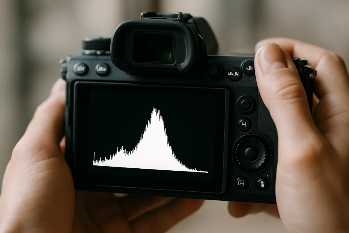
Exposure first. Look at the whole frame at fit to screen, not at your subject, and ask whether it is broadly too dark or too bright. Move the exposure slider until the picture reads correctly overall, accepting that the brightest and darkest areas may still be wrong. Those get their own steps. A useful discipline is to watch the histogram rather than the picture while you do this, since screens vary and the histogram does not; the histogram is a count of pixels at each brightness level, and moving exposure slides the whole distribution left or right without changing its shape.
Then white balance. There are three ways in and they are worth knowing in order of speed. The fastest is the eyedropper: click something in the frame that should be neutral grey or white, and the editor computes the correction. The second is a preset named for a light source, which gets you close if you know what lit the scene. The third is the two sliders themselves, temperature running blue to yellow and tint running green to magenta, which is where you end up when nothing in the frame is genuinely neutral.
The watch out is correcting warmth you actually wanted. Automatic white balance and the eyedropper both aim for technically neutral, which is often not what a warm evening looked like. As an illustrative move, a frame shot in late light might read at 4800K and be technically correct there while looking lifeless, and pushing it to 5600K restores the warmth your eye remembers. Correct to neutral first so you know where neutral is, then walk it back deliberately. Our golden hour field note covers why that light is worth protecting.
Step 4: Set the Black and White Points
With brightness and color roughly right, set where the picture’s darkest and brightest tones sit. This is the contrast step, and it is the one most beginners skip entirely, which is why so many beginner edits look flat and slightly foggy no matter what else is done to them.
Every photograph occupies a range of brightness values, and a picture with real punch usually has something genuinely black and something genuinely white in it. A file straight out of the camera, especially a raw one, often has neither: the darkest pixel is a dark grey and the brightest is a light grey, so the whole image sits in the middle and reads as hazy. The blacks and whites sliders move those endpoints. Pull blacks down until the darkest area of the frame is properly black, push whites up until the brightest area is properly white, and the picture snaps into place without any contrast slider being touched.
The histogram is the tool here, more than your eye. You are looking for the distribution to reach both edges without piling up against them. A gap at the left means nothing in the picture is black. A spike hard against the right edge means you have pushed highlights past white and lost them.
As illustrative values on a minus one hundred to plus one hundred scale, blacks around minus eight and whites around plus ten is a typical small correction for a raw file that looks flat. The watch out is that this step is scene dependent in a way the others are not. A misty morning genuinely has no black in it, and forcing one produces a picture that lies about the weather. High key portraits and snow scenes are the same. Set the endpoints where the scene actually has them, not where a rule says.
Step 5: Recover Highlights and Lift Shadows
Now the two sliders that do the most good and the most damage, usually in the same edit. Highlights and shadows are selective: they act on the bright end and the dark end of the range respectively, leaving the midtones roughly where exposure put them. That selectivity is why they come after the global steps and before anything about color.
Highlight recovery pulls detail back out of bright areas. A sky that looked like a flat white sheet often has clouds in it that the raw file recorded and the default rendering discarded. Pulling highlights down, as an illustrative move around minus thirty five on a hundred point scale, brings them back. The limit is real: past roughly minus sixty on a file that was genuinely close to clipping, recovered highlights start to go grey and slightly colorless, because the editor is reconstructing from the one or two color channels that did not saturate.
Shadow lift is the opposite and it is the most over-used control in photography. Raising it opens up dark areas so you can see what is in them. The problem is that shadows are also where noise lives, so lifting them amplifies noise, and lifting them a long way removes the darkness that gave the picture depth. Past roughly plus fifty the frame goes flat, blacks turn a milky grey, and the whole thing takes on the specific look that people mean when they say a photo is over-edited. An illustrative plus forty is a strong, honest lift; plus eighty is almost always visible as an effect rather than a correction.
The watch out is the interaction with step four. Lifting shadows raises the black point back up, which undoes the contrast you just set, so expect to go back and pull blacks down a little after a big shadow lift. That loop, shadows up then blacks down, is normal and is exactly why the two steps are adjacent. If a frame needs a shadow lift larger than your file’s latitude allows, the answer is not a bigger number; it is accepting a darker picture or, next time, a different exposure. Our low light field note covers the capture side of that problem.
Step 6: Adjust Color With Targeted Control
With tone settled, colors can be judged honestly, which is the reason this step is sixth rather than second. Any color decision made before exposure and white balance were fixed was a decision about the wrong picture.
Start by understanding the two global sliders and why one of them is nearly always the better choice. Saturation raises the intensity of every color in the frame by the same proportion, including the ones that were already strong. Vibrance raises the intensity of the less saturated colors more than the already saturated ones, and most implementations also protect skin tones. The consequence is that a global saturation push turns a face orange and a blue sky into something no sky has ever been, while the same amount of vibrance lifts the muted parts of the frame and leaves the strong parts alone. As an illustrative default, vibrance plus twelve with saturation plus four does more for a typical frame than saturation plus twenty ever will.
Then learn the control that actually separates a considered edit from a filtered one: targeted color adjustment. Most editors let you work on individual color ranges, adjusting the hue, the saturation, and the luminance of, say, the oranges without touching the blues. That is enormously more useful than any global slider. Foliage that came out an acidic yellow green can have its hue nudged without changing the sky. Skin that reads slightly too red can have the reds pulled back while the rest of the frame stays put. Lifting the luminance of the oranges by an illustrative plus ten brightens skin and warm light without brightening anything else.
The watch out is that color is where taste enters, and taste drifts. Colors you push in one session look normal by the end of it because your eye has adapted, then look garish tomorrow. The habit that fixes this is to make color adjustments quickly, move on, and check them at the start of the next session with fresh eyes.
Step 7: Crop and Straighten the Frame
Composition comes after tone and color for one practical reason: it is much easier to judge a crop on a picture that is already the right brightness. A dark uncorrected frame hides the edges and corners you are trying to make decisions about.
Straighten first, because it is objective. Find a horizon, a wall, a doorframe, or a water line, and align it. Most editors have a tool where you draw a line along something that should be level and the frame rotates to match. A tilt of an illustrative one and a half degrees is small enough that you might not consciously notice it and large enough that the picture feels subtly wrong, which is the worst combination. Note that straightening always crops a little, because rotating a rectangle inside a rectangle loses the corners, so leave yourself room at capture time.
Then crop, and crop for a reason you can name. Good reasons include removing a distraction at the edge, tightening onto the subject so it fills more of the frame, and changing the aspect ratio to suit where the photo is going. A bad reason is a vague sense that a bit off the sides would help, which usually just makes the picture smaller.
Two watch outs. First, cropping throws away pixels, and there is a limit before the file stops holding up at your output size. If you started with a twenty four megapixel frame and cropped to a quarter of it, you have six megapixels left, which is still plenty for web use and marginal for a large print. Our megapixel field note puts real numbers on that. Second, do not crop to fix a composition you can reshoot. Cropping is a repair, and a repair is always worse than the original being right.
Step 8: Sharpen and Handle Noise Last, at Output Size
The last two adjustments before export both work on individual pixels, and that is precisely why they come last. Everything before this point changed what those pixels are. Sharpening early means sharpening a version of the file that no longer exists by the time you finish.
Sharpening does not add detail. It increases contrast along the edges it finds, making light sides of an edge lighter and dark sides darker, which your eye reads as crispness. Two controls matter: amount, which is how strongly the effect is applied, and radius, which is how far from each edge the effect reaches. A small radius with a moderate amount, an illustrative amount of forty with a radius around zero point eight, gives a crisp result that does not announce itself. A large radius produces the visible pale halo that is the signature of over-sharpening, and once you can see halos you cannot unsee them.
Noise reduction is the opposite operation, smoothing variation that is not detail, and it costs you fine texture in exchange. It matters most on frames from high ISO or from a big shadow lift, which is why it sits after step five rather than before. Apply the least that makes the noise unobjectionable, an illustrative fifteen on a hundred point scale for a moderately noisy frame, and accept some grain rather than smearing hair, fabric and foliage into plastic.
The watch out, and it is the one that matters most, is judging both at the wrong size. Sharpening is resolution dependent: settings that look right at one hundred percent zoom on a twenty four megapixel file are far too strong once that file is exported at two thousand pixels wide, because the export resamples everything down and effectively concentrates the effect. Set sharpening for the size you will export, check it at one hundred percent to see what it is doing, then judge it at fit to screen to see what it looks like. If you export the same frame for both a print and a website, they genuinely want different sharpening.
Step 9: Export for Where the Photo Is Going
The final step is the one people treat as an afterthought, and it undoes good work more often than any slider. Export means producing a new file, at a chosen size, in a chosen format and color space, for a specific destination.
Three settings carry almost all of the weight. Pixel dimensions decide how large the image is; an illustrative long edge of two thousand pixels covers ordinary web use and still looks sharp on a high resolution screen, while print wants full resolution at around three hundred pixels per inch of printed size, meaning an eight by ten inch print wants roughly 2400 by 3000 pixels. Quality decides how hard the file is compressed; around eighty on a hundred point scale is the usual sweet spot, where artifacts are invisible and the file is a fraction of the size that quality one hundred produces. Color space decides how colors are interpreted; sRGB is the safe answer for anything going on the internet, and a wider space is only correct when you know the destination handles it.
Always export a copy and never overwrite the original. Non-destructive editors keep your adjustments as instructions rather than baked pixels, which means you can revisit a decision in a year, but that safety only exists while the original file survives. This is where editing and backup meet, and the seven step backup system is what keeps that original alive.
The watch out is exporting once and using the file everywhere. A file sized for a website is too small for a print, and a file sized for a print is wastefully large for a website and will be recompressed into something worse by whatever platform receives it. Export per destination. It takes seconds and it is the difference between a photo that looks the way you edited it and one that arrives softened and blotchy.
Reading the histogram while you edit
The histogram deserves its own section because it is the only feedback in the editor that does not depend on your screen, your room light, or how long you have been staring at the picture.
It is a simple thing: a count of how many pixels in the frame sit at each brightness level, drawn with the darkest values at the left and the brightest at the right. Height means quantity, not importance, so a tall spike simply means a lot of the picture is that brightness. A low key portrait against a black background produces a histogram bunched at the left and that is correct. A snow scene bunches at the right and that is correct too. There is no shape a histogram is supposed to have.
What it does tell you reliably is where you have run out of room. Pixels stacked hard against the right edge are clipped highlights with nothing left in them. Pixels stacked hard against the left edge are crushed blacks. A gap at either end means the picture never reaches that extreme, which is the flatness step four fixes. And watching the distribution move as you drag a slider teaches you what each control does faster than any explanation: exposure slides the whole shape, blacks and whites drag the ends, highlights and shadows squeeze the ends inward without moving the middle.
Most editors also offer a clipping warning that flags blown or crushed areas in a bright color as you edit. Turn it on while you learn. Seeing exactly which parts of the frame have gone past the edge, rather than inferring it from a graph, connects the histogram to the picture in a way that makes the graph readable afterwards.
Global adjustments versus local ones, and when to reach for each
Everything in the nine steps except targeted color is a global adjustment: it applies to the entire frame at once. Local adjustments apply to a chosen area, usually painted with a brush, drawn as a gradient, or defined by a shape, and modern editors increasingly select subjects and skies automatically.
The order rule still applies inside this distinction, and it is worth stating plainly: do all your global work before any local work. A local brightening on a face is calibrated against the global exposure around it, so changing the global exposure afterwards makes the local adjustment wrong. This is the single most common reason people find themselves redoing local edits.
Local adjustments earn their place in three situations. The first is a subject that needs different treatment from its background, most obviously a face that wants to be a little brighter than the scene. The second is a sky that is genuinely several stops brighter than the ground, where a graduated adjustment does what a physical filter does at capture time. The third is a specific distraction: a bright patch at the edge of the frame that pulls the eye, darkened locally so it stops competing.
The watch out is that local adjustments are where edits start looking manipulated, because human eyes are extremely good at detecting light that does not behave physically. A brightened face that is brighter than the light source hitting it reads as wrong even when the viewer cannot say why. Keep local moves small, keep their edges soft, and remember that a local adjustment applied at half the strength you first wanted is usually the one nobody notices, which is the goal.
A worked example: one underexposed backlit frame, start to finish
Theory into practice. Here is a single realistic frame run through all nine steps with illustrative numbers, so the sequence is concrete. The scene is a person standing in front of a low sun in late afternoon, shot as a raw file at ISO 400, f/4 and 1/500 of a second. The camera metered for the bright background, so the frame came back about one point two stops under overall, the subject is much darker than that, the sky behind is close to blowing out, and the whole thing has a flat, foggy quality.
Cull. There were six frames of this pose. Two have the subject blinking, one has a stray hand in the corner, and of the remaining three this one has the best expression, so it is the keeper and the other five go. Get the file in. It is raw, which matters here: the shortfall is one point two stops and raw gives roughly two and a half stops of shadow room, so the fix is comfortably inside the file’s latitude rather than a rescue.
Exposure and white balance. Exposure goes up by one point two stops, which brings the overall frame to correct and leaves the subject still too dark. The eyedropper on a neutral part of a shirt lands the temperature at 4800K, which is technically right and visually lifeless for late sun, so it goes to 5600K with tint at plus four, and the warmth of the actual afternoon comes back.
Black and white points. The histogram shows a gap at the left and nothing near the right edge, so blacks go to minus eight until the darkest shadow is genuinely black, and whites go to plus ten until the brightest part of the sky is genuinely white without stacking against the edge. The fog lifts immediately, and this is the step that does the most visible work on this frame.
Highlights and shadows. Highlights come down thirty five points, which pulls texture back into the sky behind the subject. Shadows go up forty, which opens the face without going near the plus fifty mark where things start looking artificial. That lift raises the black point slightly, so blacks get pulled down another couple of points to restore the contrast just set.
Color. Vibrance plus twelve and saturation plus four, then the targeted work that actually matters: the oranges get their luminance raised by ten, which brightens skin and the warm rim light on the hair without touching the sky, and the blues get a small saturation increase so the shaded side of the frame holds its color. Crop and straighten. The horizon is off by one and a half degrees, so it gets levelled, and the crop tightens slightly from the left to remove a bright edge distraction.
Sharpen, denoise, export. Sharpening at amount forty with a radius of zero point eight, checked at one hundred percent and then judged at fit to screen. Noise reduction at fifteen, which is enough for a forty point shadow lift at ISO 400 without smearing hair. Export at two thousand and forty eight pixels on the long edge, quality eighty, sRGB, as a copy.
Elapsed time: a little under three minutes, most of it on the color step. The result is a frame that looks like the afternoon actually looked, with a subject you can see, a sky that still has clouds in it, and no visible sign that anything was done to it. Run your own shortfall and file type through the companion above and it will do the same arithmetic on your set.
Where a good edit actually comes from
Illustrative share of the final result contributed by each group of decisions in the nine step sequence. The three parts sum to the whole outcome, so no single stage does it alone, and the largest share sits earliest.
Half the result is decided by three sliders applied in order, and none of them is the interesting one. The refinements are worth doing and they cannot rescue a frame whose tone was never fixed. Adjust the split to your own work with the companion above.
Editing at the right zoom, and how long an edit should take
Two habits do more for the quality of an edit than any adjustment, and both are about how you look rather than what you change.
The first is zoom discipline. Editing at one hundred percent for the whole session is a trap that catches nearly everyone. At that magnification you see noise, softness and minor blemishes that will be entirely invisible at the size the photo is published, and you spend the session fixing things nobody will ever see while missing that the overall frame is a quarter stop too dark. Work at fit to screen for everything except two checks: focus during culling, and sharpening in step eight. Zoom in for those, zoom back out to judge.
The second is a time limit. A two minute average per keeper sounds arbitrary and it is doing real work: it forces each step to be a decision instead of an exploration. As an illustrative session, twelve keepers at two minutes each is about twenty five minutes at the desk, which is short enough that you will actually sit down and do it. Compare that with the version where each frame takes twenty minutes and the set never gets finished, which is the far more common outcome.
There is a third habit worth adding once the first two are automatic: edit the whole set before refining any of it. Run all twelve keepers through the nine steps quickly, then go back. This does two useful things. It gives the set a consistent look, because you made the same decisions in the same order in the same sitting, and it stops you sinking an hour into frame one before discovering that frame nine was the good one all along.
Consistency across a set, and building your own preset
A set of photographs that were edited together should look like they were taken together. When they do not, it is almost never because the individual edits were bad; it is because each frame was edited in isolation against a slightly different mood.
The mechanism that fixes this is copying settings. Every editor lets you apply one frame’s adjustments to others, and for a set shot in the same light this is enormously efficient. Edit the frame you care about most, get it right, then apply those settings across the set and adjust each frame individually only for what genuinely differs, usually exposure and crop. Twelve keepers from one outing might need two minutes on the first and thirty seconds each on the rest.
A preset is the same idea made permanent: a saved bundle of adjustments you can apply to any file. Build your own once the order of operations is habit, and build it from what you find yourself repeating, not from what looks dramatic. A useful personal preset is usually boring, something like a small black point correction, a modest vibrance push, and a default sharpening amount, because those are the moves that are right most of the time.
The watch out is the one from the FAQ above, restated because it matters: a preset applied to an uncorrected file is not a shortcut, it is a mess. Presets do not know how far under your frame was or what lit it. Run steps three, four and five first, then apply a preset on top, and treat everything it did as a starting point you are still allowed to change.
Color management, screens, and why your edit looks different elsewhere
Sooner or later you will edit a photo that looks perfect on your screen and wrong on your phone, and the explanation is not that one of them is broken. It is that a digital image is a set of numbers, and turning numbers into visible light involves the screen’s brightness, its color response, and the color space the file declares.
The largest and most fixable factor is brightness. A screen at maximum brightness makes everything look bright, so you edit darker to compensate, and the file then looks murky everywhere else. A screen at minimum has the opposite effect. Setting your display to a moderate brightness in a moderately lit room fixes most of the mismatch people blame on calibration, and costs nothing.
Color space is the second factor and the simplest rule covers most cases: export in sRGB for anything going on the internet. Wider color spaces genuinely hold more colors, and they only help when everything downstream understands them, which on the open web it often does not. A file in a wide space displayed by software that assumes sRGB comes out flat and undersaturated, which is the classic symptom of exporting the wrong space.
Calibration hardware is the third factor and it is the last thing to buy, not the first. It matters when you are printing, because print is where a wrong screen costs you money on every attempt. For screen output, the honest advice is to check your edits on a second device before you decide your screen is the problem, and to spend the money on time at the desk instead. The upgrade budget planner is a good place to test whether a calibrator or another lens does more for you this year.
Common mistakes to avoid
These are the errors that turn up again and again in beginner edits, and each one maps back to a step above.
- Editing everything instead of culling. Spending the session on eighty eight frames that were never going to make it leaves no energy for the twelve that would. Cull in fast passes before any adjustment.
- Pushing the shadow slider too far. Past roughly plus fifty the picture goes flat, grey and noisy. If the frame needs more than that, it needed a different exposure at capture, not a bigger number now.
- Using saturation where vibrance belongs. Global saturation turns skin orange and skies electric because it lifts colors that were already strong. Vibrance plus targeted adjustments do the same job without the casualties.
- Sharpening before cropping and resizing. Sharpening is resolution dependent, so settings judged on the full file are wrong once the file is exported smaller. Sharpen last, at output size.
- Editing at one hundred percent zoom the whole time. You will fix flaws nobody will see and miss the global problems that actually matter. Fit to screen for judgement, zoom for checking.
- Chasing a look before fixing the basics. Applying a preset, a filter or a heavy color grade to a file whose exposure and white balance are still wrong just moves the problem. Fix, then style.
Troubleshooting the edits that will not come right
Some frames resist, and the useful skill is diagnosing which problem you have rather than sliding harder.
What if the sky is a flat white and highlight recovery does nothing? Then the highlights are fully clipped, meaning all three color channels recorded maximum and there is no data to recover. Recovery can only rebuild from a channel that survived. Accept the white sky, crop it out, or note it as a capture problem to fix next time by exposing for the bright area and lifting the rest.
What if lifting shadows makes the picture look grey and dead? That is the black point rising with the lift. Go back to step four and pull blacks down until something in the frame is genuinely black again. The pair of moves together, shadows up and blacks down, gives you the open shadows without the fog.
What if skin looks orange after a color adjustment? Almost always a global saturation push. Reduce saturation, use vibrance instead, and if the skin is still wrong, work on the oranges and reds specifically, pulling their saturation down a little while leaving their luminance alone.
What if the photo looks sharp on the computer and soft after uploading? The platform resampled and recompressed it. Export closer to the size the platform actually displays, an illustrative two thousand pixel long edge, so its own processing has less to do.
What if colors look completely different on my phone? Check the export color space first, since a wide space shown by sRGB software looks flat, then check your screen brightness. Those two account for most of it.
What if a frame just looks wrong and I cannot say why? Leave it, edit the rest of the set, and come back. Fresh eyes identify in five seconds what an adapted eye cannot find in twenty minutes, and this is the single most reliable troubleshooting technique there is.
Where editing sits against buying more gear
It is worth saying plainly, because it changes how people spend: learning this sequence returns more visible improvement per hour than most equipment purchases return per hundred pounds or dollars.
The reason is that editing addresses the failures that actually make photographs look amateur. A flat picture with no black point, a color cast nobody corrected, and a sky with no detail in it look worse than the same scene shot on a modest camera and edited in order. No lens fixes any of those three. Sharper glass makes a well edited photograph slightly better and does nothing at all for an unedited one.
There is a caveat that keeps this honest. Editing cannot recover what was never captured. It cannot invent detail in a clipped highlight, it cannot fix missed focus, and it cannot make a noisy file from a small sensor in a dark room into a clean one. Those are capture problems with capture solutions, which is exactly what our low light field note and sharpness field note exist for.
So the sensible order is the same as the order in this walkthrough: learn to cull and edit what you already have, notice which frames keep failing for reasons an edit cannot touch, and let that pattern tell you what to buy. Someone who keeps losing shots to noise at high ISO has learned something specific about their next purchase. Someone who has not edited anything has learned nothing at all, and will buy on specifications instead.
Your photo editing checklist
Save this and run down it the next time you sit down with a set:
- Cull in fast passes before opening any adjustment, expecting an illustrative one keeper in eight.
- Judge composition at fit to screen and zoom only to check focus on the survivors.
- Note whether you are working on raw or JPEG, and how many stops of latitude that gives you.
- Set global exposure while watching the histogram, not the picture.
- Correct white balance to neutral first, then walk it back deliberately if the scene was genuinely warm.
- Set the black and white points so the histogram reaches both edges without stacking against either.
- Recover highlights before lifting shadows, and keep the shadow lift under roughly plus fifty.
- Go back and pull blacks down a little after any large shadow lift.
- Prefer vibrance over saturation, and reach for targeted hue, saturation and luminance before either.
- Straighten against a real horizontal, then crop for a reason you can name out loud.
- Sharpen and denoise last, at output size, checking at one hundred percent and judging at fit to screen.
- Export a copy per destination, an illustrative two thousand pixel long edge at quality eighty in sRGB for the web.
- Copy your settings across the rest of the set before refining any single frame.
- Come back to the set once with fresh eyes before you call it finished.
The bottom line
Photo editing stops being mysterious the moment you stop treating it as a set of sliders and start treating it as a sequence. Cull hard, so your time goes to the frames that deserve it. Know what your file can take before you push it, because a raw file and a JPEG are not the same tool. Fix the whole picture before you fix any part of it: exposure, then white balance, then the black and white points, which together do about half the work and none of the glamour. Recover highlights and lift shadows with an honest eye on the point where a lift stops being a correction and starts being a look. Do color with targeted control rather than a global slider, crop for a reason, and leave sharpening and noise until the end where they belong, sized for where the photo is actually going. Then export a copy, not the original. Run one set of your own photographs through those nine steps in order tonight, give yourself two minutes a frame, and the difference between the exported files and the ones you would have produced by sliding things around will make the case better than any argument here. When you have done that a few times, price your next purchase against what editing already fixed in the upgrade budget planner, because the answer changes.
This walkthrough teaches a sequence rather than a program, which is why no software, brand or version appears anywhere in it: the nine steps hold in any editor that has the standard adjustments, whatever it calls them. Every slider value, stop figure, keeper ratio, pixel dimension and timing quoted above is an illustrative starting point drawn from ordinary editing practice, not a measurement of any particular camera, file or application, and scales differ between programs so a value of forty in one may not mean forty in another. Latitude varies with sensor, ISO and how the frame was exposed, so treat the stop figures as a rough map rather than a specification, and let the picture on your screen, not any number written here, decide where you stop.
Frequently asked questions
Do I need expensive software to edit photos properly?
No, and the reason is that the adjustments that matter most are the same ones in every editor ever written. Exposure, white balance, black and white points, highlight recovery, shadow lift, saturation and vibrance, crop, sharpening and export are universal, and the free editor that came with your operating system almost certainly has all of them under some name. What paid software buys you is speed, cataloguing, targeted local adjustments, and better raw processing, all of which are real but none of which change the order you work in. Learn the order on whatever you already have, and you will get more out of a paid editor later than someone who bought first and learned second.
Should I edit raw files or JPEGs as a beginner?
Edit raw when you can, but do not treat JPEG as unusable, because a well exposed JPEG needs very little work anyway. A raw file keeps far more of what the sensor recorded, which is why it tolerates being pushed: as an illustrative figure you can lift shadows around two and a half stops before noise takes over, against roughly one stop on a JPEG. White balance is the clearest case of all, since raw lets you change color temperature after the fact with no penalty while a JPEG has already baked it in. Our raw versus JPEG field note covers the tradeoffs in detail, including the honest cases where JPEG is the better call.
Why do my edited photos look worse than the originals?
Almost always because the edit chased a look before it fixed the basics, and the two most common symptoms are a shadow slider pushed too far and a saturation slider pushed too far. Lifting shadows past roughly the halfway point on a typical minus one hundred to plus one hundred scale flattens the picture, turns black areas grey and milky, and drags up noise that was invisible before. Global saturation pushes every color at once, so skin goes orange while the sky goes electric. Pull both back to a quarter of what felt right, fix exposure and white balance first, then reapply, and the difference is usually dramatic.
In what order should I apply photo edits?
Work from the most global adjustment to the most local, and leave anything that operates on individual pixels until the very end. That means cull first, get the file in, set exposure and white balance, set the black and white points, recover highlights and lift shadows, adjust color, crop and straighten, and only then sharpen and handle noise, at the size you are exporting to. The reason is practical rather than dogmatic: every later step depends on the earlier ones, so sharpening before you crop means sharpening pixels you are about to throw away, and boosting saturation before white balance means correcting a color cast you have already amplified.
How much should I sharpen a photo?
Less than you think, and always at the size the photo will actually be seen. Sharpening does not add detail, it increases local contrast along edges, which reads as crispness in small doses and as a hard bright outline in large ones. An illustrative starting point on a typical zero to one hundred amount scale is around forty with a small radius, checked at one hundred percent zoom and then judged again at fit to screen. The tell for over-sharpening is a pale halo where a dark object meets a bright background, and once you have seen it once you will see it in other people's photos forever.
Should I use presets and filters?
Presets are useful as a starting point and harmful as a destination. A preset applies someone else's numbers to your file, which cannot know how far under your frame was, what the light temperature was, or where your black point should sit, so applying one to an uncorrected file mostly just moves the problems around. Fix exposure, white balance and tone first, then apply a preset on top and treat everything it did as adjustable. Building your own preset once your order of operations is habit is genuinely worth it, because it captures the settings you find yourself repeating rather than someone else's taste.
What export settings should I use for the web?
For ordinary web use, an illustrative long edge of around two thousand pixels at a quality setting near eighty in the sRGB color space covers almost everything, and produces a file small enough to load quickly while still looking sharp on a high resolution screen. Social platforms recompress whatever you send them, so exporting an enormous file gains you nothing and often looks worse after their processing. For printing you want a different answer entirely: keep the full resolution, target around three hundred pixels per inch at the printed size, and use whatever color space the printer asks for. Always export a copy rather than overwriting, so the edited original stays intact.
How long should editing one photo take?
Once the order is habit, most frames take a couple of minutes, and that is the number worth aiming for rather than any measure of thoroughness. As an illustrative pace, a two minute average across twelve keepers from a hundred frame outing is about twenty five minutes at the desk, which is a session you will actually finish. The frames that take twenty minutes are usually the ones fighting a problem the edit cannot solve, such as a missed focus or a blown highlight, and recognising those early is a skill of its own. Editing slowly is not the same as editing well, and a fast confident pass in the right order beats an hour of sliding things back and forth.