What's on this page
- Before you start
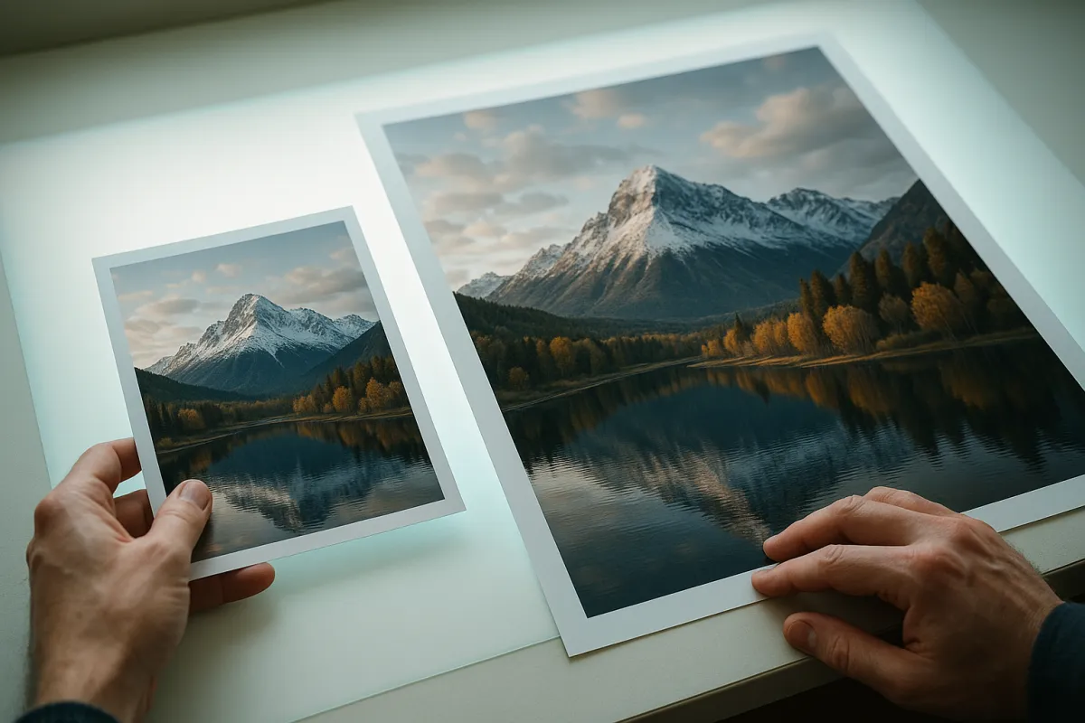
- Why a print is a different object from a screen image
- Step 1: Pick the Photograph That Deserves a Print
- Step 2: Check the Resolution Against the Print Size
- What PPI actually means
- Viewing Distance Changes the Requirement
- Aspect Ratios and Why a 3 by 2 Frame Does Not Fit an 8 by 10
- Step 3: Crop to the Print Aspect Ratio Yourself
- Step 4: Edit for Paper, Not for a Bright Screen
- Sharpening for the Size You Are Actually Printing
- Step 5: Set the Color Space and Soft Proof the File
- Gamut, Black Point, and Why Some Colors Simply Cannot Be Printed
- Resampling, Upscaling, and What Software Can Really Add
- Step 6: Choose the Paper and Decide Lab or Home
- Step 7: Order a Test Print and Iterate
- Mounting, Matting, and Framing
- Glazing, Light, and How Long a Print Lasts
- A Worked Example: One File to One Framed Print
- Common Mistakes to Avoid
- Troubleshooting the Prints That Come Back Wrong
- Your Photo Printing Checklist
- The bottom line
Short answer: Print your photos by dividing the pixels on the long edge by the inches on the long edge to get pixels per inch, cropping to the print's exact aspect ratio yourself, editing for paper by lifting shadows because prints look darker than screens, choosing a surface, and ordering one small test print before the large one. The 300 pixels per inch figure is a close inspection standard; wall prints are viewed from feet away.
There is a specific disappointment that arrives with your first print, and it is worth naming before you order anything. The picture that glowed on your screen comes back on paper looking dark, slightly flat, a little duller in the colors you liked most, and cropped in a way you did not ask for. Nothing broke. A print is a fundamentally different object from a screen image, made of reflected light rather than emitted light, and the gap between the two is predictable enough that you can correct for it in advance once you know where it comes from.
This field note takes one file from your card to a finished, framed print in seven steps. It covers choosing an image honestly, checking resolution against the print size with arithmetic you can do in your head, cropping to the paper yourself instead of letting a machine do it, editing for paper rather than for a bright display, color spaces and soft proofing described as the approximation it is, choosing a surface, ordering from a lab against printing at home, and reading the first print so the second one is right. Our megapixel field note covers whether your camera has enough resolution in the first place, and the beginner editing workflow covers the edit itself, so this article stays on the part that happens after the edit and before the wall.
Key takeaways
- Resolution is one division. Pixels on the long edge divided by inches on the long edge gives you the pixels per inch the print receives, and that number, not your megapixel count, is what decides whether a size is sensible.
- The famous 300 pixels per inch figure is a close inspection standard, roughly what a good eye resolves at about a foot. Viewing distance changes it enormously, and wall prints are viewed from feet, not inches.
- Crop to the exact aspect ratio of the print before you upload. A 3 by 2 camera frame does not fit an 8 by 10, and an automated fit will decide what to lose without asking you.
- Prints look darker than screens because paper reflects light instead of emitting it. Lift the shadow end and soften shadow contrast before you send, and set your display to a moderate brightness rather than maximum.
- Order one small test print before you commit to the large one. The correction you learn from it applies to every print you make afterwards, which makes a cheap test the highest return step in the whole process.
Before you start
Printing rewards preparation more than most photographic tasks, because every mistake is a physical object you paid for. Gather these before you begin and the whole sequence runs in one sitting.
- The original file, not a copy sized for social media. A file that has been through a messaging app or a social platform has been resized and recompressed, sometimes to a fraction of its original pixel count, and no amount of care downstream recovers it. If you shoot raw, work from the raw file; the raw against JPEG comparison explains what that buys you.
- An editing application that can crop to a specified aspect ratio and export to a chosen pixel size and color profile. Almost all of them can, including the free ones.
- A display you have not left at maximum brightness, in a room with normal lighting rather than a dark one.
- A print size in mind, and an honest idea of how far away the print will be viewed. Both feed the arithmetic in step two.
- A small budget for at least one test print. Treat it as part of the cost of the large print, not as an extra.
- About an hour for the first print you make, including the export and the ordering. Later prints take twenty minutes because the corrections carry over.
Difficulty is low, and none of it requires equipment beyond what you already own. The skill involved is arithmetic and restraint rather than technique. What makes printing feel hard the first time is that the feedback loop is slow: you send a file, wait days, and then have to work out what the paper is telling you. The steps below exist mostly to shorten that loop.
Why a print is a different object from a screen image
The single most useful thing to understand before the steps is why a print and a screen disagree at all. A screen makes its own light. Every bright pixel is a small lamp pointed at your eye, and a modern display can be startlingly bright, which is what lets a screen show a deep black next to a brilliant white in the same picture. A print makes no light. It sits under whatever illumination the room provides and reflects a portion of it, and the whitest thing it can produce is the paper itself doing nothing.
That single difference produces most of the effects people notice. The distance between the darkest and brightest thing a print can show is smaller than the distance a screen can show, so tones that were separate on screen crowd together on paper. It hits the shadows hardest, because the darkest ink a paper can hold is not very dark compared to a switched off screen pixel, so several distinct dark tones in your file land on nearly the same physical darkness. Highlight separation suffers less, but it suffers.
The second consequence is that room light becomes part of your photograph. A print viewed under warm evening lamplight is genuinely a warmer picture than the same print under daylight from a window, in a way a self-lit screen is largely immune to. Nothing in this field note fixes that, and nothing needs to. It simply means you should judge a print in the light it will live in rather than under a desk lamp, and it means a print that looks slightly cool in your hallway may look exactly right where it is going to hang.
Step 1: Pick the Photograph That Deserves a Print
Start by being unkind to your own pictures, because printing is where a merely acceptable photograph is exposed. A screen image is small, backlit, seen for two seconds while scrolling, and forgiving. A print is large, static, hung where you will see it several times a day for years, and it invites the kind of sustained looking that finds every weak decision in the frame.
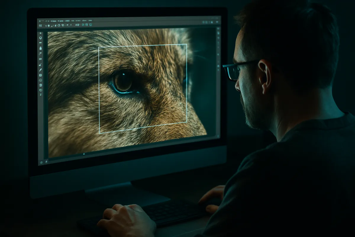
Ask three questions of a candidate. Does it hold up when you look at it for a full thirty seconds rather than a glance? A photograph that is interesting because of what it is of, rather than because of how it is made, tends to exhaust itself quickly on a wall. Is it sharp where it needs to be sharp, judged at full size rather than at a screen fitted view? Enlarging a file magnifies focus errors and camera shake in exact proportion, which is why our sharp photos field note matters more for prints than for anything else you do. And does it survive being cropped to the shape you need, which is the subject of step three?
The honest answer for most photographers is that a small fraction of their work deserves printing, and that is a healthy ratio rather than a discouraging one. Build a shortlist of five or six over a month rather than choosing the picture you made last weekend. Look at the shortlist on a screen at full size, side by side, and let it shrink on its own. The picture that survives that process is usually not the one you expected, and it is nearly always a better print than the one you would have ordered on impulse.
The watch out here is sentiment posing as quality. A photograph of a person you love has value no technical assessment touches, and there is nothing wrong with printing it because of that. Just be clear with yourself which reason you are printing for, because a sentimental print at a small size on a shelf is a different order and a different budget from a two foot piece on a wall that is asking to be judged as a photograph.
Step 2: Check the Resolution Against the Print Size
This is the arithmetic step, and it is one division. Take the number of pixels along the long edge of your file and divide it by the length of the long edge of your print in inches. The result is the pixels per inch, usually written PPI, that the print will receive. That number is what actually determines whether the print holds detail, and it is far more useful than the megapixel count on your camera’s box.
Work an example. A 24 megapixel camera with a 3 by 2 sensor produces a file of roughly 6000 by 4000 pixels. Printed at 8 by 12 inches, the long edge gives 6000 divided by 12, which is 500 PPI. At 12 by 18 inches it gives 6000 divided by 18, or about 333. At 16 by 24 it gives 250. At 20 by 30 it gives 200. At 24 by 36, a substantial wall piece, it gives about 167. Notice that the number falls smoothly and that even the largest of those is not obviously a disaster, which is the first useful thing the arithmetic tells you.
The reverse calculation is the one you will use more often. Decide the pixels per inch you want, then divide your long edge in pixels by it to get the largest print at that density. Six thousand pixels at 300 PPI is a 20 inch long edge. At 200 PPI it is 30 inches. At 150 PPI it is 40 inches. Two divisions, done in your head at the ordering page, and you never have to guess.
The watch out is that this calculation says nothing about whether the file is any good. A soft, camera shaken, heavily noise reduced file at 300 PPI prints a large, crisp reproduction of a soft photograph. Resolution sets a ceiling on detail; it does not create any. Check the file at one hundred percent zoom before you trust the arithmetic, and read the number as permission rather than as a promise.
Pixels per inch a 6000 by 4000 file delivers at each print size
Long edge in pixels divided by long edge in inches, for a 24 megapixel 3 by 2 file printed without cropping. Illustrative arithmetic, not a quality judgement.
The same file, six different densities. Nothing about the file changed between the first bar and the last; only the number of inches you asked it to cover. Run your own file and size in the [companion above](#companion) rather than reading a bar off this chart.
What PPI actually means
Pixels per inch is a ratio, not a property of your file. A file does not have a PPI until you decide how many inches it will occupy, which is why the number stored in a file’s metadata as its resolution is close to meaningless on its own and why changing that number without resampling changes nothing about the image. The file has pixels. The print has inches. PPI is the relationship you create when you choose a size.
Two other terms cause trouble and are worth separating. DPI, dots per inch, describes the printing device rather than your image: an inkjet lays down many tiny ink dots to build one image pixel, which is why a printer advertising a very high dots per inch figure is not asking for a file at that density. And LPI, lines per inch, belongs to commercial press work and appears when a lab talks about halftone screens. For everything an enthusiast does, PPI is the only one of the three you need.
What does a given PPI look like? Around 300 is the density at which a person with good eyesight, holding a print at comfortable reading distance, stops being able to see the structure and sees only the picture. Around 200 is visibly excellent at arm’s length and only reveals softness if you put your nose against it. Around 150 is entirely convincing on a wall from a few feet, which is how wall prints are actually seen. Below about 100 you begin to see softness even at normal wall distance, and below about 70 the print reads as an enlargement rather than a photograph. Those are rules of thumb from how eyes work rather than fixed thresholds, and the next section explains why the boundaries slide.
Viewing Distance Changes the Requirement
Here is the piece almost every printing article omits, and it changes the answer more than anything else in this field note. Human visual acuity is angular. A person with normal eyesight can resolve detail subtending roughly one minute of arc, which is one sixtieth of a degree. That means the smallest detail you can see is not a fixed size, it is a fixed angle, and it gets physically larger as the object gets further away.
Turn that into arithmetic you can use. There are about 3438 minutes of arc in a radian, which is a slightly odd number to meet but it is the one that makes this calculation easy. The pixels per inch that a one arcminute eye can resolve at a distance of D inches is approximately 3438 divided by D. At 12 inches, a print held in the hand, that is about 287 PPI, which is where the familiar 300 figure comes from. At 20 inches, a comfortable desk distance, it is about 172. At 40 inches, a few steps back from a wall, it is about 86. At eight feet, across a living room, it is about 36.
The practical consequence is large. A 24 megapixel file that gives 167 PPI on a 24 by 36 inch print is well past what an eye resolves at the distance anyone will actually stand from a print that size, and it would only fall short if someone walked up and put their face a foot away. This is why enormous prints from ordinary cameras look fine on walls and why the anxious rule that everything must be 300 PPI wastes money on files, on cameras, and on prints made smaller than they needed to be.
Use the rule honestly in both directions. A small print in an album, handled and examined closely, genuinely wants a high density. A large print in a hallway does not. And if someone will inevitably walk up to your wall print and inspect it, which people do with photographs of people, then design for the closer distance and accept the smaller maximum size.
Aspect Ratios and Why a 3 by 2 Frame Does Not Fit an 8 by 10
Your camera almost certainly records a frame with a 3 to 2 ratio of long edge to short edge, inherited from 35mm film. Some record 4 to 3, most phones among them, and a few offer 1 to 1 or 16 to 9 as options. Standard print and frame sizes, meanwhile, evolved separately and mostly are not 3 to 2. An 8 by 10 is 5 to 4. An 11 by 14 is 11 to 8. A 16 by 20 is 5 to 4 again. A 5 by 7 is 7 to 5. None of those is 3 to 2.
Because the shapes disagree, printing a 3 by 2 file at any of those sizes requires removing part of the picture, and the amount is easy to calculate. Express both shapes as a single number, long edge divided by short edge: your file is 1.50 and an 8 by 10 is 1.25. Divide the smaller by the larger and you get 0.833, meaning you keep about eighty three percent of the pixels and lose about seventeen percent. Going the other way, printing a 4 by 3 file at 3 by 2 loses about eleven percent.
There is one clean escape and it is worth knowing. Many labs and most frame shops will print at your file’s native ratio and let you mat it into a standard frame, so a 3 by 2 image sits inside a 16 by 20 opening with an uneven border. That preserves your composition entirely and looks deliberate rather than compromised. The alternative escape is to print with a border of white paper, which is a look many photographers prefer anyway and which gives the print room to breathe behind glass.
The thing to avoid is discovering the mismatch at the ordering screen and clicking whatever the site suggests. That is the moment the automated crop happens, and it is why the next step exists.
Step 3: Crop to the Print Aspect Ratio Yourself
Open the file in your editor, choose the crop tool, and set the ratio explicitly to the print you are ordering rather than dragging freehand. Every editor has a constrained crop mode; it may be labelled with ratios like 5:4 or with sizes like 8x10, and either works as long as you set it before you drag. Then move the crop box around the frame and decide, with your own eyes, which part of the photograph leaves.
The decisions this forces are the useful part. On a portrait you will find you can take the loss from the bottom and keep headroom, or take it from the top and crop tighter into the shoulders, and the two produce noticeably different pictures. On a landscape you will find the horizon moves relative to the frame edges as you crop, and that a composition built on thirds no longer sits on thirds after a shape change. On a photograph with something important near an edge, you may find the shape simply does not work and that a different print size fits the picture better, which is a legitimate outcome and better learned now than on paper.
Check the arithmetic after you crop, not before. Cropping removes pixels, and step two’s division has to be redone on what remains. Keeping eighty three percent of a 24 megapixel file leaves 20 megapixels, which at a 5 by 4 shape is a 5000 by 4000 pixel image, and on a 16 by 20 inch print that is exactly 250 PPI. Round numbers like that are a coincidence of this example, but the method is the same every time: crop first, then divide the surviving long edge by the print’s long edge.
The watch out is cropping twice. If you crop to 5 by 4 and then decide on an 11 by 14 print, you are cropping an already cropped file into a third shape, and the losses compound. Go back to the full original and crop once, to the final shape. Keep the original untouched; a non-destructive editor makes this free, and your backup system is what guarantees the original is still there in five years when you want a different size.
Step 4: Edit for Paper, Not for a Bright Screen
Now adjust the file for the fact that it is going onto a reflective surface. There are three moves, and they are small. Everything about editing for print is a small move, because the temptation to overcorrect produces prints that look washed out in the other direction.
First, brightness overall. Lift the exposure very slightly, in the region of a fifth to a third of a stop as an illustrative starting point, because the print will render the same numbers with less light behind them. Second, and more important, the shadow end. Raise the shadows and lower shadow contrast enough that the darkest areas of the picture still contain visible separation when you look at them on a screen set to moderate brightness. Detail that is only just visible on screen is detail that will be gone on paper. Third, sharpening, which belongs at the end and is covered in its own section below because it depends on output size.
The reason this works is worth holding onto. You are not correcting for a flaw in your printer. You are compensating for the fact that a print has less room between its blackest black and its brightest white than a screen does, so you are moving your picture’s tones inward from the dark end to fit the space available. On paper that reads as normal contrast. On screen, before printing, the edited file will look very slightly flat and lifted, and that mild wrongness on screen is the signature of a file that is correct for paper.
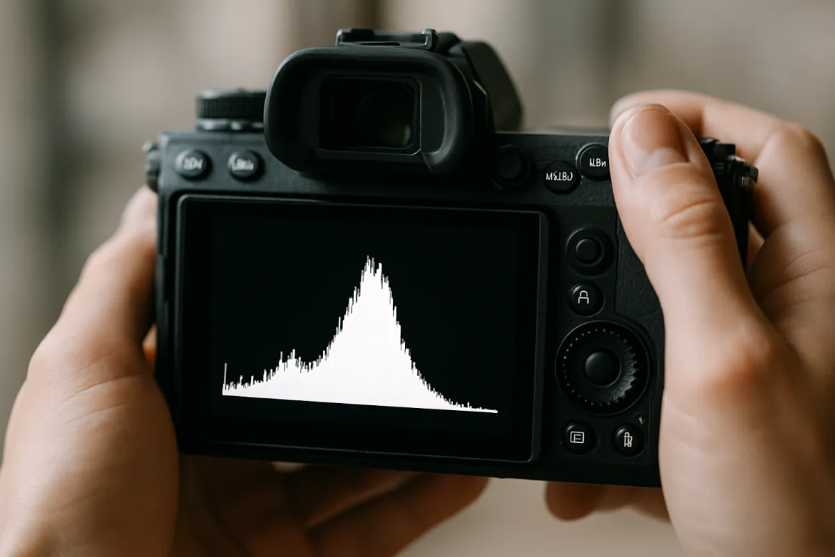
The watch out is your display’s brightness setting, which does more damage than any slider. A display at maximum brightness makes every picture look bright, so you compensate by darkening the file, and the print comes back murky. Set the display to a moderate level, work in a room with normal light rather than in the dark, and check the histogram rather than trusting your eyes about where the shadows sit. The histogram is the only readout in the editing application that does not change with how bright your screen happens to be.
Sharpening for the Size You Are Actually Printing
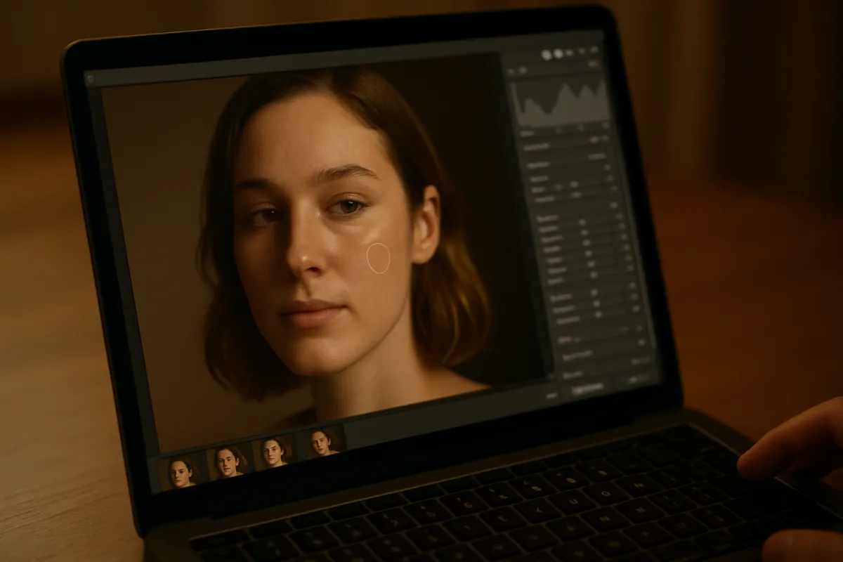
Sharpening deserves separating out because it is the adjustment most often applied at the wrong stage. Sharpening works by increasing local contrast at edges, and how strong that needs to be depends entirely on how many pixels each printed inch contains and on how the ink behaves in the paper. That means the correct amount for a web-sized export and the correct amount for a 20 inch print are different, and the correct amount for glossy paper and for a soft fine art paper are different again.
The rule that follows is simple: sharpen last, after the crop and after the resize, judged at the size the print will be. If your software offers an output sharpening option tied to paper type, use it, because those presets exist precisely because ink spreads slightly into fibrous papers and needs a stronger edge to compensate. If it does not, apply a modest amount by hand and view the file at a zoom level that approximates the finished print rather than at one hundred percent, where everything looks over-sharpened.
Prints tolerate a little more sharpening than screens do, which surprises people. The ink spread that softens fine detail eats some of the halo that would look crude on a display. That is a permission, not an instruction. Oversharpening on paper shows up as bright outlines around dark objects and a gritty texture in smooth areas like skin and sky, and unlike almost everything else in this process it cannot be blamed on the printer.
The watch out is stacking sharpening. If you sharpened during editing, then applied an output sharpen, then let the lab apply its own automatic enhancement, you have sharpened three times. Turn off any automatic correction the lab offers, sharpen once, deliberately, at the end.
Step 5: Set the Color Space and Soft Proof the File
Color management sounds like a specialist topic and reduces, for printing, to two decisions. The first is which color space you export in. A color space is a defined set of colors that the numbers in your file refer to, and if the file does not say which set it means, everything downstream has to guess. Export with the profile embedded, and choose sRGB unless the lab explicitly asks for something wider. Many consumer labs assume sRGB regardless of what you send, and a file in a wider space handed to software that assumes sRGB comes back flat and undersaturated, which is the single most common color complaint about lab prints.
The second decision is whether to soft proof. Soft proofing takes the profile that describes a specific paper on a specific printer, and uses it to simulate on your screen how your file will be squeezed into that paper’s smaller range. Labs that publish profiles for their papers are handing you this ability for free. Load the profile, turn on the proof, and look at two things: whether any saturated colors visibly shift, and whether the shadows collapse into a single tone.
Be honest about what a soft proof is. It is an approximation produced by a light-emitting screen pretending to be a light-reflecting sheet of paper, using a mathematical model of a printing process, viewed under whatever light happens to be in your room. It reliably tells you that a problem exists. It does not reliably tell you exactly what the print will look like, and treating it as a preview leads to fiddling that makes things worse. Use it to catch the two failure modes, make small corrections, then print.
The watch out is the gamut warning overlay, which flags every color the paper cannot reproduce. On a saturated photograph it will light up alarmingly, and most of what it flags will print perfectly acceptably because the rendering intent handles the compression smoothly. Look at the proofed image itself rather than the warning overlay, and only act on shifts you can actually see.
Gamut, Black Point, and Why Some Colors Simply Cannot Be Printed
Gamut is the range of colors a device can reproduce, and the reason it matters is that a screen’s gamut and a paper’s gamut are different shapes, not merely different sizes. A display produces color by adding light, so it excels at intense, luminous, saturated colors, particularly in the blues and greens. A print produces color by subtracting light with ink, so it excels in a different region and struggles precisely where a screen shines. Some vivid colors on your screen have no equivalent on paper, and no setting changes that.
What happens to those colors is decided by the rendering intent, a choice buried in export dialogs that most people never touch. Perceptual intent compresses the whole range smoothly so that relationships between colors are preserved even though every color shifts slightly. Relative colorimetric intent leaves in-gamut colors alone and clips the out-of-gamut ones to the nearest reproducible color, which is more accurate for most of the picture but can flatten a saturated area into a single tone. Perceptual is the safer default for photographs with intense color; relative colorimetric is often better for photographs that are mostly within reach anyway.
The black point is the other half of the story and it is the half you will actually notice. Every paper has a maximum density, the darkest black it can hold, and that number varies enormously between surfaces. A glossy or lustre surface reflects less light back from its own texture and so reaches a genuinely deep black. A matte or textured fine art paper scatters more light from its surface and cannot get as dark, so its blacks read as a dark gray. This is a property of the paper, not a failure of the printer, and it is the reason the paper choice in step six changes the character of your photograph more than any other decision in this process.
Resampling, Upscaling, and What Software Can Really Add
Sooner or later you will want a print larger than your arithmetic allows, and the question of upscaling arrives. Resampling means having software calculate new pixels between your existing ones so the file has more of them. Traditional interpolation does this by averaging neighbours, which produces a larger file that is genuinely no more detailed, just smoother. Machine learning upscalers do it by predicting what plausibly belongs there based on patterns learned from other images, which produces convincing texture that is invented rather than recorded.
Neither is fraud and neither is magic. For printing, modest upscaling works better than people expect, partly because the viewing distance rule is doing so much of the work: an upscaled print seen from four feet is being judged at a standard its invented detail comfortably meets. A doubling of linear dimensions, which is four times the pixels, is usually invisible at wall distance. Larger factors than that start to show, most obviously in fine repeating texture like foliage, fabric, and hair, where invented detail looks subtly artificial.
The order matters. Crop, edit, resize, then sharpen, in that sequence. Sharpening before an upscale amplifies the halos into the new pixels. And if you are sending to a lab, check whether they upscale automatically, because if they do and you have also upscaled, the file goes through the process twice.
The honest framing is that upscaling buys you one size step, not a new camera. If your arithmetic says 24 by 36 is a stretch, upscaling makes it fine. If it says a 40 inch print would land near 70 PPI, upscaling produces a large soft print rather than a large sharp one. Test the difference against the rest of your year’s spending in the upgrade budget planner before deciding that the answer is a higher resolution camera.
Step 6: Choose the Paper and Decide Lab or Home
Paper is the decision that changes how the photograph feels, and there are really three families. Lustre, sometimes called satin or pearl, has a slight surface texture that scatters reflections while still reaching a deep black. It is the default at most labs for good reason and it is the right first choice for almost any photograph. Glossy reaches the deepest blacks and the most saturated colors of any surface, and it mirrors the room so thoroughly that behind glass on a wall it is often unusable. Matte and fine art papers, including cotton rag and textured watercolor surfaces, give a soft, absorbent, painterly result with visible paper texture, at the cost of a lighter maximum black and therefore lower contrast.
Match the surface to the photograph rather than picking a favourite. High contrast work with deep shadows and vivid color, which includes most landscape and most night photography, wants the deeper black of lustre. Soft, high key, delicate work, portraits in gentle light, misty scenes, black and white with a long tonal range in the midtones, often looks better on matte, where the reduced contrast is a feature. If you cannot decide, order the same file on both surfaces at a small size once, which costs very little and settles the question permanently for your own eye.
Then the lab against home question, which for most enthusiasts has a clear answer. A lab charges per print with no equipment, no maintenance, and a wide range of papers and sizes available on demand. A home photo printer is an upfront cost in the hundreds of dollars as an illustrative band, with an ink set that is a recurring cost in similar territory over its life, plus paper, plus the specific problem that inkjet heads clog when idle, so occasional printing spends ink on cleaning cycles before it prints anything. The crossover is not about a magic number of prints; it is about whether you print in real, regular volume, whether you need same-day iteration, or whether you want a paper no lab near you stocks.
The watch out at the lab is the automatic correction option, usually presented as an enhancement or an auto-fix and often enabled by default. It will apply its own brightness, contrast, and color decisions on top of the edit you just made specifically for paper. Turn it off. You did the work; do not let it be undone by a checkbox.
Where the money goes on one framed wall print
An illustrative split of the total cost of a mid-sized framed print, ordered as a print plus a mat plus a frame. Proportions vary widely with size, materials and where you buy.
The photograph is the cheapest line on the invoice, which is the most useful thing this split has to say. Ordering a test print before committing to the other eighty percent costs almost nothing in these proportions.
Step 7: Order a Test Print and Iterate
Order one small print of the final file before you order the large one. Choose a size in the region of 5 by 7 or 8 by 10, on the same paper surface you intend to use for the real print, from the same lab. The point is not to check composition, which you already know, but to measure what that specific combination of file, lab, and paper does to your tones and colors.
When it arrives, judge it properly. Look at it in the room where the final print will hang, under that room’s light, not under a desk lamp and not next to your monitor. Give your eyes a minute to adjust. Then ask four questions in order. Is the overall brightness right, or is the whole thing sitting darker than you intended? Do the shadows still have separation, or have several dark tones merged into one mass? Is there a color cast across the neutral areas, greens in the grays or a warm shift in white? And is the sharpness right at the distance you will view it from?
Each answer maps to a correction you apply to the file and carry forward forever. Dark overall means lift exposure by a small amount and note the amount. Blocked shadows means raise the shadow slider and reduce shadow contrast. A cast means checking your export profile first, since a wrong or missing profile causes more casts than any printer does, and the white balance field note covers diagnosing the rest. Soft means adjusting output sharpening for that paper.
The watch out is changing several things at once and reprinting, which teaches you nothing about which change did what. Change one, or at most two clearly separate things, then print again. Two test prints is normal for a first attempt with a new lab and paper. After that your corrections are known and you can order large prints with confidence, which is exactly the position this whole sequence exists to put you in.
Mounting, Matting, and Framing
A print becomes an object when it goes into a frame, and a few decisions there protect both the look and the lifespan. Matting, the card window that sits between the print and the glass, does two jobs. Visually it gives the photograph a margin of quiet so the eye settles on the picture rather than on the wall. Physically it holds the print away from the glazing, which matters because a print pressed against glass in a humid room can stick to it permanently, and separating them destroys the print.
Mounting is how the print attaches to the backing. The reversible approach uses hinges of archival tape at the top edge so the print hangs freely and can be removed later without damage. The permanent approach bonds the whole print to a rigid board, which lies perfectly flat and looks excellent, and which you cannot undo. For a print you may want to remat, resize, or sell later, hinge it. For a print going on a wall and staying there, mounting flat is fine and avoids the gentle waviness large unmounted prints develop.
Frame choice is aesthetic and there is no technical right answer, with one caveat: a frame that competes with the photograph will win, because it is bolder and simpler. A narrow, quiet moulding in a neutral tone disappears and lets the print work. As the cost chart above shows, the frame is usually the largest single line on the bill, which is worth knowing before you walk into a custom framer with a print you have not tested.
Handling matters more than people expect. Fingerprints on a print surface are oils that mark permanently on some papers, so handle prints by the edges or with clean cotton gloves, work on a clean dry surface, and never stack prints face to face without interleaving paper. A print you have already paid for is easy to ruin in the two minutes between opening the package and closing the frame.
Glazing, Light, and How Long a Print Lasts
Glazing is the sheet in front of the print, and it does more for the finished result than the frame around it. Plain glass is cheap and clear and reflects the room, which on a print hung opposite a window makes the picture unviewable during daylight hours. Non-glare glass has an etched surface that diffuses reflections at the cost of slight softening, most noticeable when the glass sits further from the print. Museum glazing uses optical coatings to cut reflection without the softening, and costs a great deal more. Acrylic is lighter and shatter resistant, which matters for large pieces, and scratches more easily.
Ultraviolet filtering is a separate specification that can be combined with any of the above. Ultraviolet light drives most of the fading in both dye and pigment prints, so filtering glazing genuinely extends the useful life of a print. It is not a complete defence, because visible light and heat also contribute, and it is a real cost premium.
The free half of print preservation is placement. Do not hang a print in direct sunlight, ever, regardless of glazing. Avoid exterior walls in damp climates and rooms with large humidity swings such as bathrooms and kitchens. Keep prints away from heat sources. A print in a shaded hallway will outlast the same print above a sunlit sofa by a wide margin, and that difference costs nothing to arrange.
Longevity claims deserve skepticism generally. Manufacturers publish estimates based on accelerated light exposure tests under defined conditions, and the numbers vary with paper, ink chemistry, glazing, and display environment, so the honest statement is that pigment based prints on quality paper behind ultraviolet filtering glazing, kept out of direct light, last a very long time, and that any specific number of years quoted without those conditions attached is not telling you much. Store the file properly as well; a backed-up original is the only genuinely permanent version of any photograph you make.
A Worked Example: One File to One Framed Print
Take a real sequence end to end with numbers, using illustrative figures throughout. The file is a landscape from a 24 megapixel camera, 6000 by 4000 pixels, shot raw. The plan is a 16 by 20 inch framed print for a living room wall, viewed from about five feet most of the time but examined closely by anyone who walks up to it.
Step one settles the choice: of four candidates from a weekend, one holds attention for thirty seconds and is sharp across the frame at full zoom. Step two runs the division before cropping: 6000 divided by 20 gives 300 PPI on the long edge, which is comfortable, but 16 by 20 is a 5 by 4 shape and the file is 3 by 2, so step three has to happen first. Cropping 1.50 to 1.25 keeps 1.25 divided by 1.50, or about eighty three percent of the pixels, leaving 20 megapixels arranged as 5000 by 4000. The crop is taken from the bottom edge, which removes an uninteresting foreground and lifts the horizon.
Redo the division on the cropped file: 5000 pixels divided by 20 inches is 250 PPI, and 4000 divided by 16 is also 250, which confirms the shapes now match. At the five foot viewing distance the one arcminute rule asks for about 3438 divided by 60, or 57 PPI, so 250 is generous by a wide margin. Even at a close 12 inch inspection the requirement is about 287, so the print is very slightly under the close-inspection standard and comfortably over everything else. That is a print worth making.
Step four lifts exposure by about a quarter of a stop, raises shadows moderately, and reduces shadow contrast a little, checked against the histogram rather than by eye. Step five exports a copy in sRGB with the profile embedded, soft proofed against the lab’s lustre profile, where the deep blue in the upper sky shifts slightly and nothing else moves. Step six chooses lustre and a lab, with all automatic enhancement switched off. Step seven orders an 8 by 10 test on the same paper first. The test comes back marginally dark, so the exposure goes up another sixth of a stop, and the 16 by 20 is ordered. Framed with a mat, a plain moulding, and ultraviolet filtering glazing, and hung on a wall that gets no direct sun. Total elapsed time, excluding shipping, under two hours across two sittings.
Common Mistakes to Avoid
These are the errors that produce most disappointing prints, and every one of them maps back to a step above.
- Printing a file that has been through a social platform or a messaging app. It has been resized and recompressed, often to a small fraction of the original pixels, and the compression damage enlarges along with everything else. Always print from the original.
- Editing on a display at maximum brightness. You will darken the file to compensate without noticing and the print will come back murky. A moderate brightness in a normally lit room fixes more print problems than any other single change.
- Letting the ordering page crop the image. An automated fit removes from whichever edges are longest, with no idea what is in the picture, which is how heads lose their tops and horizons drift.
- Leaving the lab’s automatic enhancement enabled. It applies a second set of brightness, contrast, and color decisions on top of yours, and it is often on by default.
- Exporting without an embedded color profile, or exporting in a wide color space to a lab that expects sRGB. Both produce a flat, undersaturated print that gets blamed on the paper.
- Ordering the large print first. A test print at a small size costs a fraction of the framed piece and turns every subsequent print from a gamble into a known quantity.
- Sharpening more than once, at more than one stage, and then letting the lab sharpen again. Sharpen once, last, at output size.
- Choosing a paper because it sounds premium rather than because it suits the photograph. A fine art matte surface on a high contrast night scene throws away exactly the deep blacks that made the picture work.
Troubleshooting the Prints That Come Back Wrong
What if the print is dark but the shadows still look fine? That is a straightforward global brightness offset between your display and the paper, and it is the easiest fault to fix. Raise exposure by a small increment, note the amount, and apply it to everything you send to that lab on that paper from now on.
What if the shadows have merged into one black mass but the overall brightness is right? That is the tonal range difference rather than a brightness error, and the correction is different: raise the shadow slider and reduce shadow contrast, leaving the exposure alone. If it persists, the paper may simply be a low maximum density matte surface being asked to do a job a lustre surface would do better.
What if there is a color cast across the neutral areas? Check the export first, because a missing or mismatched color profile causes far more casts than any printer does. Confirm that the exported file carries an embedded sRGB profile and that automatic enhancement was disabled. If the cast survives that, ask the lab whether they publish a profile for the paper and soft proof against it.
What if the print looks sharp in the middle and soft at the edges? That is a lens or focus issue in the original file rather than a printing fault, and printing has merely magnified it. Check the file at one hundred percent zoom in the corners. It is also worth checking whether the crop pushed you into a region of the frame the lens never rendered well.
What if the print is visibly pixelated rather than merely soft? Pixelation, meaning visible square blocks, means the file was genuinely too small, or was upscaled aggressively, or arrived compressed. Recheck the arithmetic on the file you actually sent rather than the one on your card, since a resized export is easy to send by accident.
And what if everything is technically correct and the print still feels flat? That is often not a fault at all. Prints are calmer objects than screens, and a photograph that depended on the luminous punch of a backlit display can genuinely lose something on paper. Sometimes the honest answer is that the photograph is a screen photograph, and a different image from the same shoot is the print.
Your Photo Printing Checklist
Run this list before you upload, and again before you order anything large.
- Print from the original file, not from an export, a download, or anything that has passed through a social platform.
- Look at the file at one hundred percent zoom and confirm it is sharp where it needs to be, before spending anything.
- Decide the print size and write down how far away it will usually be viewed.
- Divide the long edge in pixels by the long edge in inches and note the pixels per inch you will get.
- Divide 3438 by the viewing distance in inches and compare the two numbers.
- Crop to the exact aspect ratio of the print yourself, in one operation, from the full original.
- Redo the pixels per inch division on the cropped file, because the first answer is now out of date.
- Set your display to a moderate brightness and work in a normally lit room.
- Lift exposure slightly, raise the shadow end, and reduce shadow contrast, checking the histogram rather than your eyes.
- Resize to the final output dimensions, then sharpen once, judged at print size.
- Export in sRGB with the profile embedded unless the lab has asked for something else in writing.
- Soft proof against the lab’s paper profile if one is published, looking for saturated color shifts and collapsed shadows only.
- Choose the paper surface for the photograph: lustre for contrast and deep blacks, matte for softness and texture.
- Turn off every automatic enhancement, correction, or optimisation the ordering page offers.
- Order a small test print on the intended paper first, and judge it in the room the final print will hang in.
- Apply one or two corrections from the test, note them permanently, then order the large print.
- Mat the print so it does not touch the glazing, and hinge rather than bond it if you may want to remount later.
- Hang it out of direct sunlight, away from damp exterior walls and heat sources.
- Keep the original file backed up, because it is the only permanent copy of the photograph.
The bottom line
Printing is not a mysterious craft, it is a short chain of decisions where each link has an honest answer. Choose a photograph that earns a wall rather than one that earns a scroll. Do the one division that turns pixels and inches into pixels per inch, then temper it with the viewing distance rule, because a wall print judged by a hand-held standard is money spent on detail nobody will stand close enough to see. Crop to the paper yourself so the losses are choices. Edit for a reflective surface by lifting the shadow end slightly and accepting that the file will look mildly flat on the screen you edited it on, which is the sign you did it right. Set the color space deliberately, treat soft proofing as a warning system rather than a preview, and pick a paper for what the photograph needs rather than for what sounds expensive. Then spend a small amount on a test print, because it converts a gamble into a repeatable process, and the correction you learn once applies to everything you print afterwards. Run your own file, print size and viewing distance through the companion above to see the numbers for your camera, and weigh the framing bill against the rest of your year in the upgrade budget planner.
This field note describes a general method for getting a photograph onto paper and names no printer, paper, lab or software brand, because the right combination depends on your file, your eye and what is available where you live, and because products change faster than any article can track. Pixel counts, densities, percentages and the cost proportions shown here are rounded planning figures and illustrative bands used to demonstrate the arithmetic, not measurements of any particular product or quotes from any supplier, so confirm real specifications, profiles and current pricing before you order. The acuity rule used for viewing distance is a widely used approximation of normal vision rather than a measurement of your eyes, and print longevity depends on ink chemistry, paper, glazing and where the print hangs, so treat any lifespan claim, including a manufacturer’s, as conditional. Nothing above is professional archival, conservation or framing advice; for work you intend to preserve or sell, speak to a qualified conservator or framer.
Frequently asked questions
What resolution do I need to print a photo?
Divide your file's pixel dimensions by the print's dimensions in inches and you have the answer directly. A 6000 by 4000 pixel file printed at 8 by 12 inches delivers 500 pixels per inch, and the same file at 20 by 30 inches delivers 200. The often quoted 300 pixels per inch is not a law, it is roughly what a person with good eyesight can resolve on a print held at about a foot away, so it applies to prints you inspect closely and overshoots badly for anything hung on a wall. Work out the number your own file gives at the size you want, then decide whether the way that print will be viewed justifies it.
Why do my prints come out darker than they look on screen?
A screen emits light and a print reflects it, so the screen is showing you a picture lit from behind at a brightness a sheet of paper under room lighting cannot match. When you edit on a bright display you unconsciously pull the exposure down until the picture looks right on that display, and on paper the same file has less light to work with and the shadows close up into a single dark mass. The usual fixes are to set your display to a moderate brightness rather than maximum, to judge the file in a normally lit room rather than a dark one, and to lift the shadow end and reduce shadow contrast slightly before you send the file. If your first print comes back dark, that is information, not failure, and the correction is repeatable on every print after it.
Should I let the lab crop my photo to fit the paper?
Almost never, because the lab has no idea which part of your frame matters. Most cameras record a 3 by 2 frame and most popular print sizes are not 3 by 2, so something has to come off, and an automated fit will take it symmetrically from whichever pair of edges is longest. That routinely clips the top of a head, a hand, or the horizon you carefully placed. Crop the file to the exact aspect ratio of the print yourself before you upload it, so the decision about what leaves the picture is yours.
What is soft proofing and can I trust it?
Soft proofing is a preview mode in editing software that simulates, on your screen, what a particular paper and printing process is likely to do to your file. It works by taking the profile that describes that paper and process and using it to squeeze your image into the smaller range of colors and tones the paper can reproduce, then showing you the result. It is genuinely useful for spotting the two things that go wrong most often, saturated colors that cannot be reached and shadow detail that collapses, and it is honestly described as an approximation rather than a preview. Your screen is still emitting light and the paper still is not, so treat the soft proof as a warning system and the first physical print as the real proof.
Which paper should I choose for my first print?
A lustre or satin surface is the sensible default for a first print and stays the right answer for most photographs. It holds deep blacks and good contrast the way a gloss surface does, but its slightly textured finish scatters reflections instead of mirroring the room, which matters a great deal once a print sits behind glass on a wall. Matte and fine art papers look beautiful in the hand and give a softer, more painterly result, but they cannot reach the same maximum black, so contrast drops and deep shadow detail flattens. Order the same file on two surfaces once, look at them side by side in the room where the print will live, and you will know your own preference for good.
Is it cheaper to print photos at home or use a lab?
For most enthusiasts the lab is cheaper and better, and the arithmetic is not close. A home photo printer is an upfront cost in the hundreds of dollars as an illustrative band, and the ink set behind it is a recurring cost that runs into the same territory over time, with the additional problem that inkjet heads clog when they sit unused, so infrequent printing wastes ink on cleaning cycles before you print anything. A lab charges per print with no equipment to maintain and no cartridges going stale. Printing at home starts to make sense when you are producing prints in real volume, when you want an immediate turnaround while iterating, or when you want a specific fine art paper a lab does not stock.
How much can I crop and still get a good print?
More than most people fear, as long as you do the arithmetic instead of guessing. Cropping removes pixels, and the pixels per inch a print receives falls with the square root of the area you keep, so keeping half the frame costs you about thirty percent of your pixels per inch rather than half of it. A 24 megapixel file cropped to half its area still delivers roughly 175 pixels per inch on a 16 by 20 inch print, which is comfortable for a wall piece viewed from a few feet. Check the number for your own file and print size, and treat the crop as a decision about the picture rather than a technical worry.
Does the glass in a frame matter?
It matters more than the frame around it. Ordinary glazing reflects the room, which on a print hung opposite a window can make the picture unviewable for half the day, and it passes ultraviolet light that fades dyes and pigments over years. Non-glare and museum glazing reduce the reflection problem by different means, and ultraviolet filtering glazing slows fading, both at a real cost premium over plain glass. The cheaper half of the same protection is free: hang the print out of direct sunlight, keep it off exterior walls that get damp, and accept that any print in a bright room ages faster than the same print in a hallway.