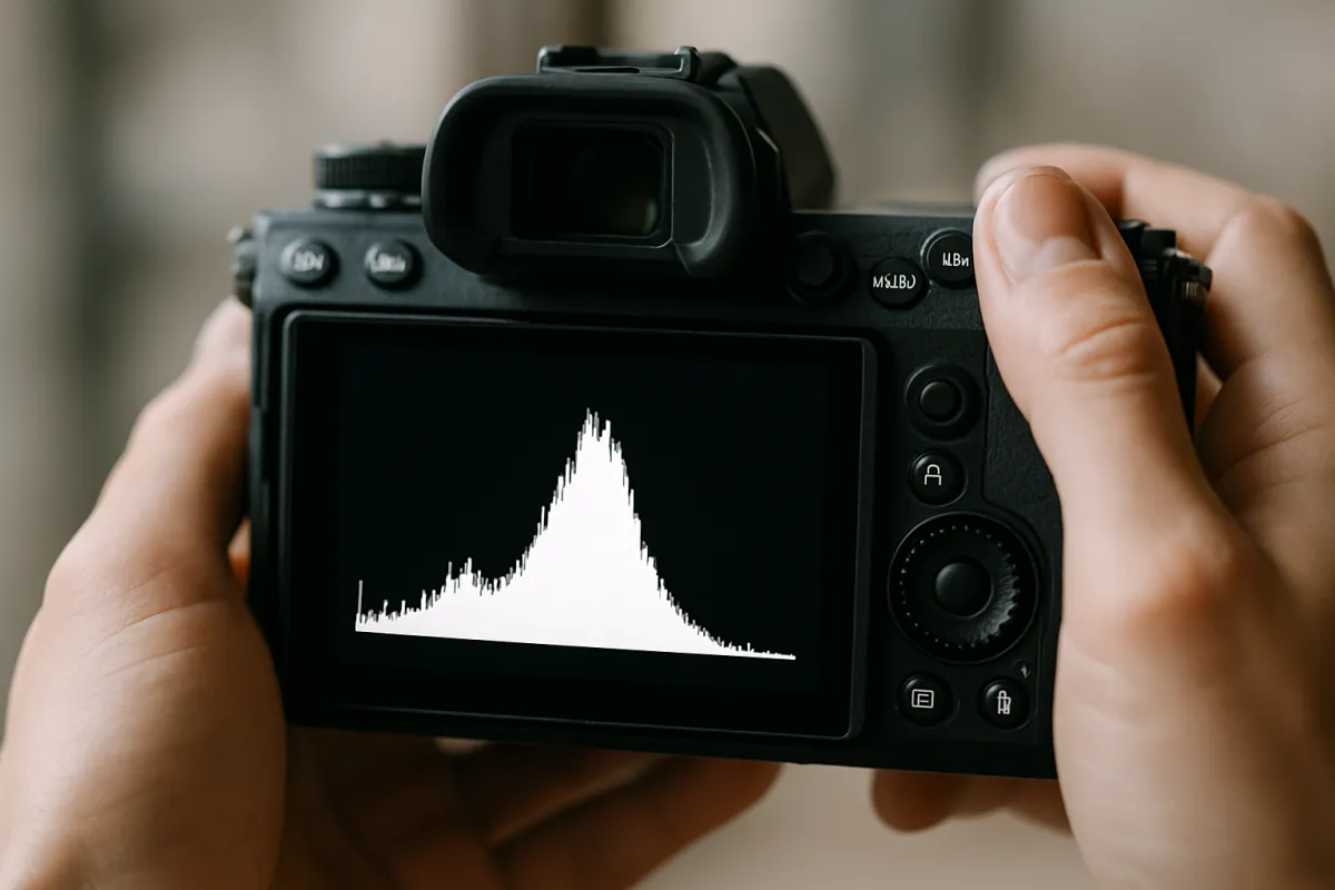
What's on this page
- What a histogram actually plots
- Left to right: black to white
- Why there is no such thing as a correct histogram
- The two walls: what clipping means
- Why clipped highlights are usually gone for good
- Why clipped shadows are sometimes fine
- When both ends clip: the dynamic range problem
- Luminance versus the RGB histogram
- When one channel clips and the combined view looks fine
- Blinkies: the fast version in the field
- The JPEG preview problem for raw shooters
- How to close the gap between preview and raw
- Expose to the right: the idea
- Expose to the right: the honest caveats
- High-key scenes: when the graph belongs on the right
- Low-key scenes: when the graph belongs on the left
- Live histogram versus playback histogram
- Why the rear screen lies
- How the graph moves when you change each setting
- Reading the histogram in the editor
- Combing and gaps in a stretched histogram
- Common histogram mistakes
- A three-check field routine
- Teach yourself the histogram in one afternoon
- The bottom line
Short answer: A histogram is a graph that counts the pixels in a photo by brightness: black on the left, white on the right, with the height of each column showing how many pixels sit at that level. There is no correct shape, because it describes the scene rather than the quality of the exposure. The useful information lives at the two ends: pixels stacked against either wall are clipped to pure white or pure black.
The rear screen on the back of your camera is a small backlit display that you view in wildly varying light, and it will lie to you about exposure almost every time. Outdoors in sun, the same photograph looks dark and you brighten the next one until the highlights are gone. Indoors at night, the same photograph looks bright and you underexpose everything for an hour. The histogram exists precisely because eyeballing a screen is not a measurement, and it is the one thing on the camera that reports what the file contains rather than what a piece of glass appears to show under whatever light you happen to be standing in.
This field note is the missing entry in our run of exposure references, alongside what aperture is, what shutter speed is, and what ISO settings do. It explains what the graph actually plots, how to read the two ends where the real information lives, the difference between the combined and the per-channel views, why the graph on a raw shooter’s camera is not showing raw data, and how to read scenes whose tones legitimately pile up at one end. The exposure triangle field note covers how the three settings trade; this is how you check the result.
Key takeaways
- A histogram counts pixels by brightness: the horizontal axis runs black on the left to white on the right, and the height shows how many pixels sit at each level. It says nothing about where in the frame those pixels are.
- There is no correct shape. The graph describes the scene, not the quality of your exposure, so a bright subject should sit right and a dark one should sit left.
- The two ends carry all the useful information. Pixels stacked against a wall are clipped, meaning pure white with no texture or pure black with nothing recorded.
- Clipped highlights are usually unrecoverable because nothing was stored; clipped shadows often hold a weak signal that lifts back, at the price of noise.
- On a raw shooter's camera the graph is built from an embedded JPEG preview, so it warns early and the raw file typically holds a little more highlight room than it suggests.
What a histogram actually plots
Strip away the intimidating name and a histogram is a tally. The camera walks through every pixel in the image, asks how bright that pixel is, and drops it into one of a series of brightness bins. Then it draws the result as a chart: one narrow column per bin, its height set by how many pixels landed there. Nothing more sophisticated is happening. It is the same arithmetic you would use to chart how many people in a room are each height, except the measurement is brightness and the population is a few million pixels.
The bins run across a fixed scale. A standard eight-bit image records 256 possible brightness levels per channel, numbered 0 through 255, so a display histogram typically has 256 columns squeezed side by side into a box a couple of hundred pixels wide. On a small rear screen the columns merge into a continuous silhouette, which is why the thing reads as a mountain range rather than a bar chart. That silhouette is all the chart is: a running count, left to right, of how much of your picture sits at each brightness.
Two consequences follow immediately and are worth fixing in your head now. The histogram knows nothing about composition, subject, or where in the frame anything sits, so a bright sky in the top third and a bright shirt in the bottom third produce the same bump. And the vertical axis has no units you need to care about; the graph is usually scaled so the tallest column fits the box, which means a tall spike simply indicates the most populated brightness in that particular frame.
Left to right: black to white
The horizontal axis is the part people misread, so make it concrete. The far left edge is level zero, pure black, a pixel with no recorded light. The far right edge is the maximum level, pure white, a pixel that has taken all the signal the file can hold. Everything in between is a continuous ramp from one to the other, with the deep shadows in the left quarter, the middle tones in the middle, and the bright tones and highlights in the right quarter.
Photographers often overlay a stop scale onto that axis, and it helps once you know one wrinkle: the axis is not evenly spaced in stops. Display encoding compresses the bright end and stretches the dark end so the numbers correspond roughly to how the eye perceives brightness, which means the rightmost portion of the graph covers a lot of light and the leftmost portion covers very little. That is why moving a picture one stop brighter shifts the graph a large visual distance when it is dark and a smaller one when it is already bright.
For everyday use you do not need the mathematics, only the direction. Something in the picture got brighter, the graph moved right. Something got darker, it moved left. Contrast increased, the graph spread out toward both ends. Contrast decreased, it bunched toward the middle. Four sentences cover nearly everything you will read off the chart in the field.
Why there is no such thing as a correct histogram
This is the correction that saves the most photographs, and it contradicts a great deal of well-meant advice. A histogram is a description of the tones present in the scene. It is not a score for your exposure. The pleasant hill centered under the middle of the box that so many tutorials hold up as the target is simply what an average subject in even light produces, and treating it as a goal means brightening dark scenes into gray mush and darkening bright ones into the same.
Work through the obvious cases and the point makes itself. A black cat on a black blanket, correctly exposed, produces a graph that lives almost entirely in the left third, because almost every pixel genuinely is dark. A white plate on a white tablecloth, correctly exposed, produces a graph crowded into the right third. If you pushed either toward a centered hill you would be recording a lie about the subject, and you would have to undo the damage in editing, if it could be undone at all.
The useful question is therefore never “does this look like the right shape”. It is “is anything I care about jammed against an edge, and does the distribution match what I can see in front of me”. Those two checks take a second each, are answerable, and are what the chart is genuinely good for. Everything else in this field note is detail hanging off that one reframing.
The two walls: what clipping means
Clipping is what happens when a value runs out of room. A pixel brighter than the file’s maximum cannot be recorded as brighter, so it is recorded as the maximum; a pixel darker than zero cannot be recorded as darker, so it is recorded as zero. Every such pixel piles into the outermost bin, which is why clipping shows on the graph as a vertical spike jammed hard against the left or right wall rather than a curve that tapers away before it arrives.
Learn to see the difference between touching and stacking. A curve that slopes down and just kisses the edge means the darkest or brightest tones in your scene happen to sit at the limit, which is usually fine. A flat-topped column standing against the wall like a stud in a frame means a population of pixels has been crushed to a single value and whatever distinguished them from each other is gone. The visual signature is a vertical line at the boundary, and once you have seen it a few times you spot it instantly.
Some clipping is not merely acceptable but correct. Specular reflections, the pinpoint glare off chrome or water or an eye, are supposed to be featureless white; a night sky between stars is supposed to be featureless black. Trying to hold detail in either produces a flat, muddy photograph. The judgment is always about what is clipping, not whether anything is, and that judgment is why the highlight alert covered further down is such a useful companion to the graph.
Why clipped highlights are usually gone for good
Ask an editor to recover a blown highlight and you are asking it to reconstruct information the file never held. When a pixel maxes out, the only fact stored is that it reached the ceiling. Whether the real scene at that spot was a fraction brighter than the ceiling or twenty times brighter, the number recorded is identical, so nothing in the data distinguishes the bright cloud edge from the sun behind it. Pull the highlight slider down and you get a uniform gray patch where texture should be, which usually looks worse than the white did.
The reason this bites so often is that the clipped areas tend to be the subjects people care about. A white wedding dress in sun, the sky behind a portrait, a window in an interior, the bright side of a face lit from one direction. All are large, smooth, attention-getting areas where the absence of texture reads as an error rather than as a stylistic choice. A blown pinprick on a car bumper is invisible; a blown cheek is a ruined frame.
Which is why highlight protection is the default discipline for digital capture, and it is the opposite of the habit film shooters brought with them. Film shoulders off gently at the bright end and holds detail well past where you would expect; a digital sensor hits a hard ceiling and stops. Expose for the brightest thing you need texture in, and let the shadows fall where they fall, is a working rule that costs you very little and saves a lot.
Why clipped shadows are sometimes fine
The left wall behaves differently, and the difference is not symmetry. A shadow that reads as zero on the display histogram is often not truly empty in the underlying raw data; it holds a weak signal sitting just above the sensor’s noise floor. Lift it in editing and something does come back, which is why shadow recovery feels almost magical compared with highlight recovery. What comes back is dark detail wrapped in grain, because amplifying a weak signal amplifies the random variation in it too, exactly as described in our ISO field note.
Whether that trade is worth taking depends on the picture. Noisy recovered detail in a shadowed doorway behind your subject is perfectly serviceable at any normal viewing size. Noisy recovered detail across the whole lower half of a large print is not. And plenty of photographs are improved by letting the shadows go: a low-key portrait where the dark side of the face falls to black, a night street where the sky is genuinely black, a silhouette that only works because the subject is a solid shape.
The practical rule that falls out of the asymmetry is the one photographers state as protect the highlights, fix the shadows. If you must choose which end to sacrifice, sacrifice the left, because the left sometimes gives something back and the right almost never does. That preference is baked into how most people set exposure compensation in tricky light, and it is why the histogram check most photographers actually run is a right-hand check.
When both ends clip: the dynamic range problem
Sometimes you check the graph and find spikes at both walls simultaneously. That is not an exposure error you can correct by turning a dial, and understanding why saves a lot of wasted fiddling. It means the range of brightness in front of the lens is wider than the range your sensor can record in one frame. Brighten the exposure and the shadow spike shrinks while the highlight spike grows; darken it and the reverse happens. You are sliding a fixed-width window across a scene that is wider than the window.
The real fixes are not settings. Change the light: wait for cloud, move the subject out of the sun, add a flash or a reflector to raise the shadows toward the highlights, as covered in our manual mode walkthrough. Change the framing so the brightest area is out of the picture. Use a graduated filter over a bright sky. Or take several frames at different exposures and blend them afterward, which trades field time for a file that holds the whole range.
Failing all of those, choose which end to lose on purpose rather than by accident. Decide that the sky will go white and expose properly for the people, or decide the people will fall to silhouette and expose properly for the sky. A deliberate sacrifice usually looks like a photograph. An accidental one usually looks like a mistake, and the histogram is what turns the accident into a decision made before you walk away.
Tone levels available in each stop of a linear 14-bit raw file
Illustrative counts for a file with 16,384 levels per channel, recorded linearly. Each stop down halves the range and therefore halves the levels describing it.
This halving is the whole argument behind exposing to the right, and it is also why it is oversold. The level counts are real arithmetic for linear encoding, but perceived quality in the shadows is limited more by signal-to-noise ratio than by how many levels are on offer.
Luminance versus the RGB histogram
Most cameras will show you the graph in more than one form, and the two worth knowing are luminance and RGB. The luminance histogram collapses the three color channels into one brightness curve, weighted to match how the eye responds: green contributes the largest share of perceived brightness, red a smaller one, and blue the smallest of the three. It is the closest thing to a chart of how bright the picture looks, and it is the right default view for ordinary scenes.
The RGB view instead draws three separate curves, one per channel, usually overlaid in red, green, and blue with the overlapping regions shown in mixed colors. Read this way the chart tells you not only how bright the picture is but how the color is distributed: a strong shift of one curve to the right against the others means a color cast, which is the same information a white balance check gives you and is discussed in more depth in our white balance field note.
Some bodies also offer a combined view that stacks a small luminance graph and a small RGB graph together on the playback screen. If yours does, that is the view to leave switched on. It costs nothing, it takes the same one-second glance, and it protects you from the specific failure covered in the next section, where the combined brightness curve looks entirely healthy while one channel has already hit the wall.
When one channel clips and the combined view looks fine
Here is the trap. A deeply saturated color is, by definition, a color where one channel is far higher than the others. A pure saturated red might have its red channel near maximum with green and blue near the bottom. Because red contributes only part of perceived brightness, the luminance curve for that area sits somewhere in the middle of the graph, looking perfectly comfortable. Meanwhile the red channel has already stacked against the right wall and any variation in that red is gone.
What you get back is a flat, plastic-looking area of color with no texture: the petals of a red flower rendering as a single shape, an orange traffic cone with no shading on its curve, a red dress that turns into a silhouette of a dress. The tell is that the area looks wrong in a way the brightness of the picture does not explain, and no highlight slider recovers it, because the recovery has only two intact channels to work from and must guess at the third.
Two habits prevent it. Switch to the RGB view whenever your subject includes intense reds, oranges, magentas, or deep blues, which in practice means flowers, sunsets, autumn foliage, stage lighting, and a great deal of product work. And pull exposure back a third to two thirds of a stop when you see a single channel approaching the edge, since a small reduction usually fixes a channel that has only just begun to crush.

Blinkies: the fast version in the field
The histogram has one blind spot: it tells you how much of the frame is clipped but nothing about where. That distinction decides whether you reshoot. Most cameras solve it with a highlight alert, universally called blinkies, which flashes a black or striped overlay over the blown regions during playback. In one glance you learn both facts at once, that something is clipped and that it is the sky rather than your subject’s forehead.
Turn it on and leave it on. It costs no battery worth mentioning, it does not interfere with anything, and it converts highlight checking from a task into a reflex. The workflow that experienced photographers actually run is not a careful study of the graph; it is a quarter-second glance at the playback frame to see whether anything important is flashing, with the histogram reserved for the frames where the answer is ambiguous or where the light is about to change.
Two limitations are worth carrying. The alert usually triggers on the combined preview rather than per channel, so a single clipped channel may not blink at all, which is the case for switching to the RGB graph. And like the graph, on most cameras the alert is computed from the preview image rather than the raw data, so it fires slightly before the raw file has genuinely run out. Treat a blink as a prompt to look closer, not as a confirmed loss.
The JPEG preview problem for raw shooters
This is the piece that most explanations skip, and it changes how you should act on what the camera tells you. When you shoot raw, the camera still builds a small JPEG preview and embeds it in the file, because a raw file is sensor data that nothing can display directly. That preview is what appears on the rear screen, and it is what the histogram and the highlight alert are computed from. The graph you are reading is therefore a graph of a processed image, not of the data you will actually edit.
The processing matters. That preview has been through your picture profile, its contrast curve, its saturation setting, and its white balance. A contrast curve by design steepens the ends of the tone range, pushing bright tones brighter and dark tones darker to make the image look punchy on screen, which means the preview reaches its ceiling while the raw values behind it still have room left. Saturation does the same thing to individual channels, and an aggressive white balance multiplier can push one channel up before the others.
The result is a graph that is conservative, warning you about clipping a little earlier than the raw file deserves. That is the safe direction to be wrong in, but it does cost you something, because you leave usable highlight room unused on every frame. How much room is genuinely there depends on your camera and your profile, and it is worth measuring rather than assuming; the raw versus JPEG field note covers what else the two formats do differently.
How to close the gap between preview and raw
You cannot make a camera display a true raw histogram if it does not offer one, but you can make the preview it displays much closer to the raw. The move is to flatten the profile the preview is generated from. Choose the most neutral picture profile your camera offers, then reduce contrast and saturation within it, and if your body has a highlight tone or shadow tone adjustment, pull the highlight setting down. A flatter preview clips later, so the graph lines up more closely with the file underneath it.
None of this touches your raw data. The picture profile is recorded as a tag and applied to the JPEG preview, so the raw file you edit is unchanged either way. What changes is the honesty of the readout, and the price you pay is a rear-screen image that looks duller than the photograph will eventually look. Many photographers consider that a bargain and never turn the contrast back up.
Then measure your own margin. Photograph a scene with a smooth bright area, a white wall lit by a window works, and take a sequence of frames increasing exposure in third-stop steps until the on-camera graph shows clear highlight clipping. Open the sequence in your editor and find the frame where the raw genuinely clips. The distance between the two frames, in thirds of a stop, is your camera’s headroom, and it is commonly somewhere between a fraction of a stop and rather more than a stop. Write it on a card and use it.
Expose to the right: the idea
Expose to the right, usually shortened to ETTR, is the technique of pushing exposure as bright as the scene allows without clipping the things you care about, so the graph sits as far right as it safely can. The reasoning comes from the chart above. A sensor counts photons linearly, but stops are a doubling scale, so the brightest stop of a fourteen-bit file holds roughly 8,192 of its 16,384 levels while five stops down holds around 256. Data recorded in the bright end is described in far finer increments than data recorded in the dark end.
The payoff appears when you plan to lift the shadows afterward. Capture a shadow-heavy scene at a normal exposure and the dark areas are recorded near the bottom of the range, where levels are scarce and the sensor’s own noise makes up a bigger share of what is there. Capture the same scene a stop or two brighter and those same shadows are recorded higher up, with a stronger signal, and then pulled back down in editing. The result is measurably cleaner in the dark areas, which is the whole prize.
In practice ETTR means setting the exposure so the rightmost meaningful part of the graph approaches the wall without touching it, then correcting brightness during editing. The files look wrong on the back of the camera, pale and washed out, and they are supposed to. Our beginner editing workflow covers the pull-back step, which is one slider and takes a second per frame.
Expose to the right: the honest caveats
The technique is real and the enthusiasm around it outruns the benefit, so here are the qualifications that rarely make it into the pitch. First, extra exposure has to come from somewhere: a slower shutter that risks blur, a wider aperture that changes the depth of field, or a lower ISO that only helps if the light allows it. Trading sharpness for cleaner shadows is a bad trade in almost every situation, and it is a trade beginners make without noticing.
Second, the level-count argument oversells the case. Perceived shadow quality is governed mostly by signal-to-noise ratio, not by how many discrete levels are available, and modern sensors with very low read noise show much less benefit from ETTR than sensors from earlier generations did. On many current bodies, brightening a normally exposed raw file in editing gives results close to what a brighter capture would have given, which removes most of the reason to take the risk.
Third, you are steering by a conservative gauge. Since the graph comes from a JPEG preview, the true clipping point is somewhere past where the camera says it is, and you do not know exactly where without the measurement described above. Push to the visible edge and you are guessing. The sensible posture: use ETTR for tripod work, still subjects, and deliberately shadow-heavy scenes where you control the variables, and shoot normally the rest of the time. If you are budgeting an upgrade around low-light performance, the upgrade budget planner is a better use of attention than a third of a stop.
High-key scenes: when the graph belongs on the right
A high-key photograph is one whose tones are mostly light: snow, fog, a white studio background, a pale beach, a bright interior, a subject in white against white. Correctly exposed, all of these produce a histogram bunched into the right portion of the box, and that shape is not a warning. It is an accurate report that the scene is bright. The failure mode here is trusting the camera’s meter, which is built to average a scene toward a middle tone and will therefore darken a bright subject into gray.
The fix is exposure compensation in the positive direction, often by a stop or more for a full frame of snow, and then a histogram check to confirm you went far enough without going too far. What you are aiming for is a mass of data crowded near the right with the peak clear of the wall, so the whites read as white rather than as pale gray, with any small clipped area confined to genuine specular glints.
Judging that by eye on a rear screen outdoors in bright light is close to impossible, which is why high-key scenes are where the graph earns its keep most obviously. Two frames and a look at the chart will get you a properly exposed white subject in less time than it takes to squint at the screen and guess wrong twice.
Low-key scenes: when the graph belongs on the left
The mirror image is a low-key photograph: a dim room lit by one lamp, a stage with a spotlit performer, a night street, a portrait lit from one side against a dark background. Correctly exposed, the data piles into the left portion of the graph with only a small population out toward the right, and again that is a description, not a diagnosis. The scene is dark, so the graph is dark.
The meter fails here in the opposite direction, brightening a dark scene toward the average and giving you a washed-out gray version of something that should have been moody. Negative exposure compensation is the correction, and the histogram check confirms it. The thing to watch is the small right-hand population, because in low-key work the highlights are usually the subject: the lit face, the lamp-lit hands, the performer. Protect those, and let the rest of the graph fall where it falls.
One caution particular to this end. A left-leaning histogram and an underexposed histogram look similar, and they are not the same thing. The low-key frame has its important tones correctly placed and the darkness is the subject; the underexposed frame has its important tones sitting too far left and needs lifting, which brings the noise penalty discussed above. Deciding which one you have is a question about the scene, not about the chart, and it is one of the few places the graph genuinely cannot answer for you.
Live histogram versus playback histogram
There are two moments to look at the graph, and mirrorless cameras give you both. The playback histogram appears after the frame is taken and describes the file you just made. The live histogram appears in the electronic viewfinder or on screen before you press the shutter and describes what the current settings would produce. The second is the more useful of the two, because it lets you correct exposure without spending a frame, and it is one of the concrete advantages an electronic viewfinder has over an optical one.
Learning on a live histogram is remarkably fast. Change the aperture and watch the graph slide; change the shutter and watch it slide the other way; raise ISO and watch it move right while the shadow end lifts off the wall. You are seeing the exposure relationships in real time instead of inferring them from files afterward, which is why the settings covered in the aperture and shutter speed field notes tend to click faster for people who shoot mirrorless.
If your camera has an optical viewfinder you only get the playback version, and the routine adapts: take one frame as a test, read the graph, adjust, then shoot. Most bodies can also show the live version in their rear-screen live view mode, which is worth using for tripod work where you are not in a hurry. Either way the habit is the same, and the habit is what matters more than the mechanism.
Why the rear screen lies
It is worth being explicit about the failure the histogram exists to fix, because knowing the mechanism makes the discipline stick. Your rear screen is a small emissive display whose brightness is fixed by a menu setting, while your eyes constantly adapt to the light around them. In bright sun your pupils are contracted and your visual system is calibrated for a very bright world, so a screen at its normal setting looks dim and any photograph on it looks underexposed. In a dark room the reverse happens and the same photograph looks bright.
The predictable consequence is a whole day of frames drifting in one direction. Photographers who chase the screen outdoors come home with blown highlights across the set; photographers who chase it at night come home with everything a stop dark. Auto-brightness features help but do not solve it, because they adjust the screen and cannot adjust your adapted eyes, and screen brightness also affects how contrast reads, not just overall level.
The histogram is immune to all of this because it is a count, and a count does not change with ambient light. That is the entire case for using it. You are not replacing your judgment about the picture, which the screen is still fine for; you are replacing your judgment about exposure, which the screen was never capable of. Once that split is clear, the chart stops feeling like homework.
How the graph moves when you change each setting
Building an intuition for cause and effect turns the histogram from a report into a tool. Open the aperture by a stop, or slow the shutter by a stop, and the whole graph slides right by roughly the same visual distance, since both add light before the sensor. Raise ISO by a stop and the graph also slides right, but the mechanism differs: no extra light was gathered, only amplified, which is why the shadow end lifts away from the left wall while noise increases underneath.
Contrast controls behave differently, and this is where people get confused. Raising contrast on a JPEG profile does not move the graph as a block; it stretches it toward both ends, pushing highlights right and shadows left while the middle stays roughly put. Lowering contrast pulls both ends inward toward the center. That is why a flat profile produces a narrow graph and a punchy one produces a wide graph from identical light, and why flattening the profile buys you the preview honesty described earlier.
White balance moves the individual channels rather than the whole thing. Warming an image raises the red channel and lowers the blue; cooling does the opposite. On a luminance graph the effect is modest, which is exactly why the RGB view is the one that catches a channel about to clip from a white balance choice rather than from overall brightness.
Where an illustrative day's frames land on the histogram check
An illustrative split of one enthusiast's outing by what the graph reported. The shape, not the exact percentages, is the point.
The split is illustrative rather than a measurement, but the lopsidedness is typical: most frames are fine, the right-hand wall is the one that costs you photographs, and the left-hand wall is mostly a warning about how much noise you are about to accept.
Reading the histogram in the editor
The same chart appears in every editing program, usually pinned above the adjustment sliders, and it works identically with two useful differences. It updates live as you drag, so you can watch a highlight recovery move the right end of the graph away from the wall, and it is computed from the raw as your editor is currently interpreting it, which makes it more honest than the camera’s version. That second point is the reason the file so often turns out to have more highlight detail than the camera implied.
Two controls interact with the chart directly. The white point and black point set where the ends of the tone range land, so dragging them is literally dragging the ends of the graph inward or outward. The curve tool reshapes the distribution: lifting the middle of the curve moves the bulk of the graph right, steepening it spreads the graph toward both ends. Watching the chart while you do either is the fastest way to understand what those tools are doing.
Most editors also paint clipping warnings onto the preview, triggered by clicking the small triangles at the top corners of the histogram panel. Turn both on while you set the ends of the tone range. It is the desk-bound equivalent of the blinkies, it is more accurate than the camera’s version, and it stops the very common error of dragging the black point too far in pursuit of contrast and crushing shadow detail you meant to keep.
Combing and gaps in a stretched histogram
Open an edited file’s histogram and you may see a comb: regular vertical gaps running through the graph like missing teeth. That pattern is a record of how hard the file has been pushed. Stretching a limited set of tone levels across a wider range spreads the existing values apart and leaves empty bins between them, since editing can move levels around but cannot create new ones that were never recorded.
Combing matters because it warns of banding, the visible stepping you sometimes see in a smooth gradient like a clear sky or a studio backdrop, where a continuous transition breaks into discrete strips. It is far more likely in an eight-bit file with its 256 levels per channel than in a raw file with thousands, which is one of the concrete reasons to edit from raw and export to eight bits at the very end rather than the other way around.
If you see heavy combing, the useful response is to ask what produced it. A big exposure lift, an aggressive curve, a strong white balance shift after conversion, or repeated rounds of saving an eight-bit file are the usual culprits. The fix is almost always to go back to the raw and do the work once, in a higher bit depth, rather than to apply another correction on top of a file that has already been stretched thin.
Common histogram mistakes
The first and largest is chasing a shape. Anyone brightening a night scene or darkening a snow scene to produce a centered hill is using the tool backwards and will keep producing gray, characterless files until they stop. The graph reports the scene. Judge the two ends and the match to what you see, and ignore the middle entirely.
The second is panicking at any contact with a wall. Almost every real photograph has some pixels at zero and some at maximum, and that is normal. What matters is whether the clipped population is large and whether it sits in something that should have texture. A vertical spike is worth a look; a curve that tapers to the edge is not.
The third is forgetting that the camera’s graph is a JPEG’s graph, and either trusting it as gospel or dismissing it entirely. It is a conservative, useful approximation, and the correct response is to learn your own camera’s margin and then act on the graph with that margin in mind. The fourth, quieter mistake is relying only on the luminance view while photographing saturated color, then wondering why the flowers came back flat. And the fifth is checking the histogram carefully on one frame and then shooting fifty more without looking, after the light has changed.
A three-check field routine
The whole practice collapses into three quick checks that fit between frames. Check one, the blinkies: glance at the playback image and see whether anything is flashing. If nothing is, move on. If something is, ask whether it is a specular highlight, in which case move on, or a textured area you need, in which case go to check two.
Check two, the right end of the graph: is the population against the wall a real stack or just a taper. A real stack means dial in negative exposure compensation, usually a third to two thirds of a stop, and shoot again. Check three, the left end, and only when shadows are part of the subject: is the graph piled against zero in an area you intend to lift later. If it is, add exposure if the shutter speed and aperture allow it, or accept the noise.
Run those three in the order given and you will spend perhaps two seconds per frame, less once the pattern is automatic. Re-run them whenever the light changes, whenever you move from sun into shade, whenever a subject with a strong color enters the frame, and whenever you change lenses or modes. That cadence, rather than any deep knowledge of the chart, is what separates people whose exposures are consistently right from people who fix everything afterward.
Teach yourself the histogram in one afternoon
Reading about the graph does very little; watching it move does almost everything. Start with the exposure ladder. Put the camera on a tripod, aim it at an ordinary scene with a full range of tones, set manual mode, and shoot the same frame at five exposures: two stops under, one under, metered, one over, two over. Line them up on a large screen and look at the histograms in sequence. You will see the whole graph slide across the box, and the ends stack and unstack, which is the core lesson in five files.
Next, the subject ladder. Photograph three deliberately different subjects at correct exposure: something predominantly white, something predominantly black, and something mixed. Three graphs, three completely different shapes, all correct. That exercise is what permanently kills the idea of a target shape, and it is worth doing even if you think you already believe it.
Finish with the channel test and the headroom test. Photograph something intensely red or orange, filling much of the frame, and compare the luminance and RGB views on the same file. Then run the bracket described earlier to find how much highlight room your raw holds past what the camera reports. By the end of the afternoon you will have four numbers and one habit, and the chart will read as information rather than as decoration.
The bottom line
A histogram is a count of your picture’s pixels by brightness, drawn black on the left and white on the right, and it is the only exposure readout on a camera that does not change with the light you happen to be standing in. It has no correct shape, because it describes the scene rather than grading your work, so bright subjects belong on the right and dark ones on the left. All the information you need lives at the two ends: a stack against the right wall means highlights with no texture and usually no way back, while a stack against the left means shadows that will lift at the price of noise. Switch to the per-channel view when the color is intense, leave the highlight alert on, and remember that on a raw shooter’s camera the graph is built from a JPEG preview and warns you early, which is a margin worth measuring once and using forever. Learn the three-check routine, run it whenever the light shifts, and the graph stops being a chart and becomes what it always was: a second opinion that cannot be fooled by a backlit screen. When gear rather than technique becomes the limit, the upgrade budget planner is the place to size the next move.
This field note describes how brightness histograms behave in general, and it names no camera, sensor, or software on purpose, because the arithmetic behind the chart is the same everywhere while the menus and labels are not. Every level count, stop figure, headroom range, and percentage above is an illustrative reference chosen to show the relationships, not a measured specification for your body, so run the bracket test described here and let your own files set your numbers. Highlight recovery, shadow noise, and preview accuracy all differ by camera generation and picture profile, and the picture you are making, not any chart on any screen, remains the final judge of whether the exposure was right.
Frequently asked questions
What is a histogram in photography, in plain terms?
A histogram is a bar chart of your photograph's brightness. The horizontal axis runs from pure black on the far left to pure white on the far right, and the height of the graph at any point shows how many pixels in the frame sit at that brightness. A tall spike in the middle means a lot of the picture is a middle tone; a hump near the right means a lot of it is bright. It is the only readout on a camera that tells you what the file actually contains rather than what a backlit screen appears to show.
What does the perfect histogram look like?
There is no perfect shape, and chasing one is the single most common mistake beginners make with the graph. A histogram describes the tones in the scene, not the quality of your exposure, so a photograph of a snowy field should pile up on the right and a photograph of a candlelit room should pile up on the left. The gentle hill centered under the middle that appears in so many tutorials is simply what an average, evenly lit subject produces. The only readings that are genuinely informative are the two ends, where the graph tells you whether detail has been pushed off the edge.
What is clipping on a histogram?
Clipping means pixels have hit the limit of what the file can record and have stacked up against one edge of the graph. On the right, clipped pixels are pure white with no texture left in them; on the left, they are pure black with nothing recorded. You see it as a vertical spike jammed against the wall rather than a curve that tapers off before it gets there. Small amounts are normal and often desirable, since specular reflections and deep shadow are supposed to be featureless, but a large clipped area in something that should have texture, like a bride's dress or a bright sky, is detail you cannot bring back.
Why are clipped highlights harder to fix than clipped shadows?
Because clipped highlights contain no information at all, while clipped shadows usually contain a little. When a pixel maxes out, the file records only that it reached the ceiling, with no record of how far past the ceiling the real scene went, so an editor asked to recover it has nothing to work with and can only invent a flat gray. Deep shadows, by contrast, usually hold a weak signal that can be amplified, and what you get back is dark detail buried in noise. Noisy recovered shadows are often perfectly usable in a finished photograph, whereas a blown white patch almost never is.
What is the difference between the RGB histogram and the luminance histogram?
The luminance histogram combines the red, green, and blue channels into a single brightness curve, weighted the way human vision responds, which means green contributes most and blue contributes least. The RGB histogram shows the three channels separately, so you can see each one's distribution and each one's clipping. The practical consequence is that a strongly saturated color can drive one channel all the way to the wall while the combined luminance curve still looks comfortable, because that channel contributes only part of the perceived brightness. If your subject includes intense reds, oranges, or deep blues, the separate channel view is the one worth watching.
What are blinkies or the highlight alert?
Blinkies are the flashing overlay some cameras paint over blown areas during image playback, and they answer the question a histogram cannot: where in the frame the clipping actually is. The histogram tells you that a percentage of pixels hit the ceiling but says nothing about whether those pixels are a distracting patch on a face or a harmless sun reflection off a car bumper. Turning the alert on costs nothing and turns highlight checking into a one-second glance. Like the histogram on most cameras, the alert is generated from the preview image rather than from raw data, so treat it as an early warning rather than a verdict.
Is the histogram on my camera showing me the raw file?
Almost certainly not. Even when you are shooting raw, the graph and the highlight alert are calculated from a small JPEG preview the camera embeds in the file, and that preview has been through the picture profile, contrast curve, saturation, and white balance settings on your camera. Because a contrast curve steepens the ends of the tone range, the preview reaches its ceiling before the raw data does, which means the camera warns you about clipping slightly early. The practical effect is that a raw file typically holds a little more highlight detail than the on-camera graph suggests, and the size of that margin is worth measuring on your own body rather than assuming.
Should I expose to the right?
Expose to the right means deliberately pushing exposure as bright as the scene allows without clipping anything you care about, because a sensor records light linearly and the brightest stop of the file carries far more tone levels than the darkest one. It genuinely helps on shadow-heavy raw work where you plan to lift the dark areas afterwards, since a brighter capture means a cleaner lift. The caveats are real, though: it costs shutter speed or aperture you may need, the files look washed out until you pull them back, and the histogram you are judging by is conservative, so the safety margin is guesswork. It is a technique for deliberate, static work rather than a habit for every frame.